


A Splash Of Colour At TEFAF - 5 - Reds & Greens, Old & New
Journeying from purpurine to red, lavender and onwards via Wartski, Joost van den Bergh, Peter Finer and VKD Jewels

While researching and writing my first four ‘TEFAF + colour’ pieces:
• A Splash Of Colour At TEFAF
• 2 - Kate Malone
• 3 - SANTI
• 4 - Junko Mori
I learned that I needed to include additional questions to artists and dealers, other than simply: “Please discuss one or more of your exhibition pieces through the perspective of colour.” Because without modification, their most common reaction was to steer me towards their most brightly coloured pieces. And these weren’t necessarily what I was interested in. I was in search of surprises. I was hoping to stumble across things that might change my way of thinking. (That might perhaps even change your way of thinking as well!)
I guess this appeared most directly - up front and centre - in my conversation with Junko Mori. “Yes she’s a lovely person and artist,” I was thinking going in, “but she works with steel. And with silver. Meaning, with black, and with white. What will she be able to tell me about colour?” And yet I think that conversation stretched my perceptions the most, because it encouraged me to look further, to look deeper.
So my process taught me I needed to add a few qualifier questions for the dealers and artists I was meeting. Like:
• Given the date (or period) of creation of this piece, what are some notable aspects of the colour(s) being used? Are these colours typical or atypical of the period?
• (If it’s an older piece) - have its colours changed over time? If so, how?
• Are any rare colours involved? If so, what made (or makes) these colours rare?
What follows are places some of these questions took me in our discussions (which have been edited for length and clarity), while conversing in the booths of a few different dealers. I hope you enjoy!
Wartski - Spotlight on Carl Fabergé
During an unusually quiet moment at London-based jeweller Wartski, while chatting with the delightful and insanely knowledgable jewellery expert Katherine Purcell, the topic of a colour’s ‘rarity or otherwise’ was the one that really made her eyes light up. “Do you know about purpurine?” she asked, almost gleefully. I was happy to shake my head in (real) ignorance, because from the twinkle in her eye I could see she had stories to tell. “Come this way,” she smiled in satisfaction, as she led me to a vitrine.
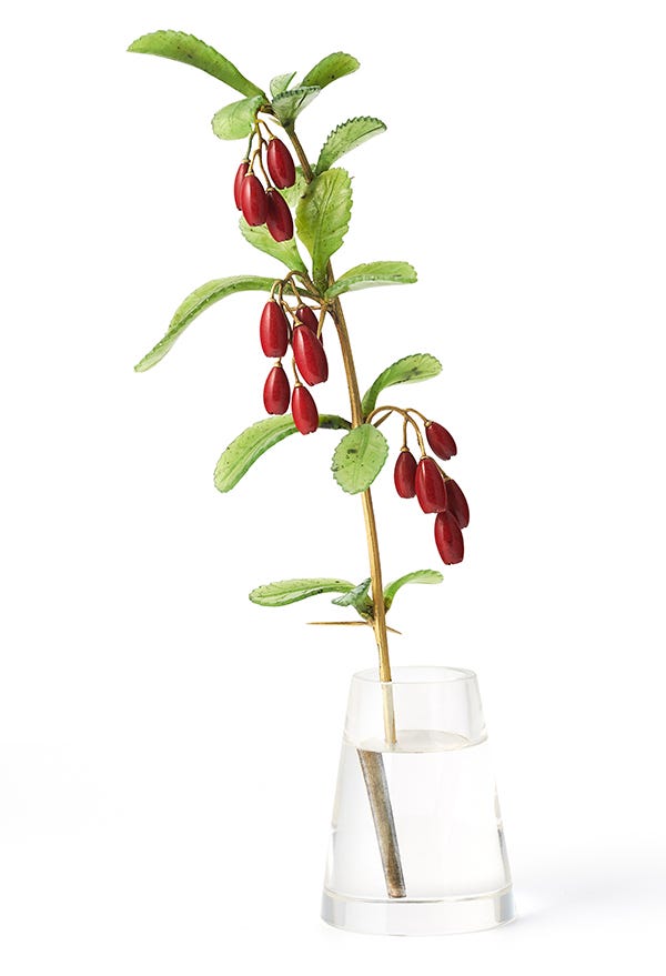
“The thing I find most fascinating about this is that there he was, Carl Fabergé and his firm, at the turn of the 19th into the 20th century, serving as jeweller and goldsmith to the tsars of Russia, European royalty, and the great and good all over the world. He had many highly experienced artisans in his employ, who made use of a wide variety of exotic gemstones and precious materials. His company developed enamels in the most exquisite colours - many of which, to this day, we cannot replicate. And yet - even within all of that - none of the red colours that were available to him were exactly right for some objects he wanted to create. So he reached back into history, all the way to ancient Roman times for a kind of red they used, the recipe of which had been lost to time. Purpurine. And at Fabergé, they managed to recreate purpurine, for objects like this one.” Katherine gestured to a small ashtray before us.
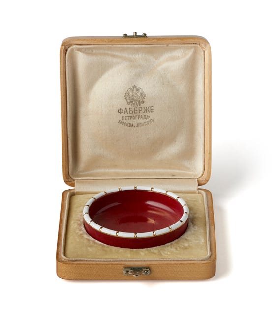
“Wow!” I exclaimed, now that I was able to both see this particular kind of red in front of me, and call it by its correct name: purpurine.
As a side note: there are many fascinating things to explore on the topic of ‘colour + language.’ If you’re curious to know more, check out Part One of my series A Splash Of Colour (In Your Day), which was the precursor to this TEFAF series.
“But what, actually, is it?” I asked Katherine. “Is it an enamel? Or a kind of stone?” “No,” she replied, “It’s definitely not enamel, and I know it’s not a stone - I think you could say it’s a kind of glass.”
“Really?” I said, peering closer. “So what are the main elements that give it that red colour?” (And yes, I was indeed one of those irrepressible “Why?” children!)
“Well, then let’s look that up, shall we?!” Katherine extracted her phone and began searching through various ‘purpurine’ results. But to my amusement she kept dismissing one after the other, for not giving her precise enough information.
And just so you understand who’s doing the phone-searching here, Katherine is the author and/or co-author of multiple, highly regarded books on jewellery, including:
• Henri Vever’s French Jewelry of the Nineteenth Century - the first ever complete translation into English of Vever’s huge La Bijouterie Française au XIXem Siècle.
• Falize: A Dynasty of Jewellers and
• Bejewelled by Tiffany
My amusement level was not really helped by the fact that, in between the searches, advertisements exhorting “Become a jewellery expert!” kept popping up on Katherine’s phone. “Seems they need to work on their ad-targeting algorithm, non?!” I observed. Katherine gave a wry chuckle - in between the ads she’d found something. “An opaque bright red stone-like material,” she read. “A glass based concoction… that was typically cast into blocks which were then sawed and carved using traditional lapidary and gem carving techniques.”
Together we both found that copper is also somehow in the mix. But we also discovered this topic of purpurine was leading us down an informational rabbit hole that neither of us really had time for in that moment. So I thanked Katherine for opening my eyes to this new colour/substance and went on my way, intrigued to do some further research back at the hotel. We’d spent so much time talking, searching, and looking in front of the ashtray pictured above though, that I entirely missed some of their other vitrines.
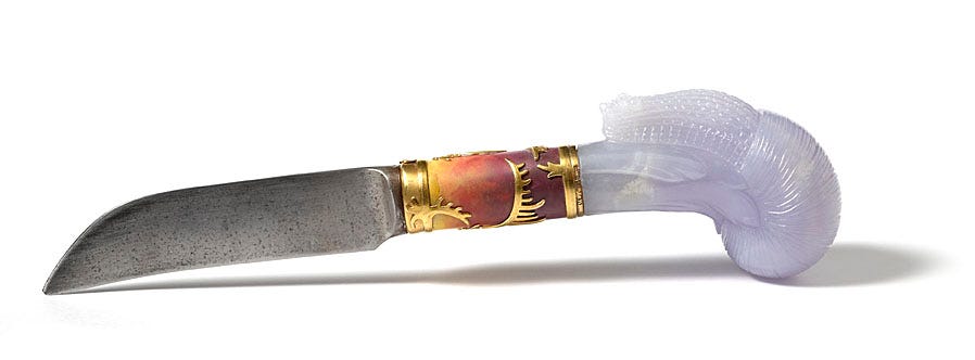
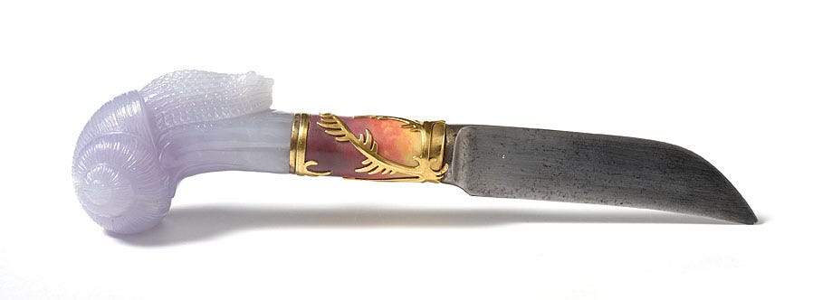
It was only on a subsequent visit, now that my eye was attuned to seeking out purpurine, that also I saw Wartski’s beautiful Fabergé jade-leaf and purpurine-barberry sculpture (pictured at top). Which was when my eye also fell upon their extraordinary Fabergé knife, pictured below. Extraordinary to me for the fact that:
• Those mixed, yellow through to orange and reddish-purple colours in the shaft of the knife, are all achieved with enamel.
• The handle, exquisitely carved into the form of a snail, is made from jade - a stone that you most commonly think of as being green, but is here having one of its very rare lavender or bluish moments.
• It’s a “gardening knife.” Not really of the sort I’d leave hanging around with my shovels, rakes and weeders in my garden shed though, I don’t think!
If you would like to delve more into some of the fascinating history around purpurine, I recommend the website Conciatore, for its whole sub-section on purpurine. For clarification: in sixteenth and seventeenth century Florence, a "conciatore" was a specialist in alchemy who formulated glass from raw materials.
And before we leave the subject of Wartski, I cannot not tell you about an upcoming loan exhibition they’re staging entitled: The Brooch. From Function to Fantasy. A stupendous array of brooches, from 1200 BCE to the contemporary, curated by none other than Ms. Katherine Purcell! It’s happening at Wartski, 60 St James St, London, from the 1st to the 12th of October, 2025.
Joost van den Bergh
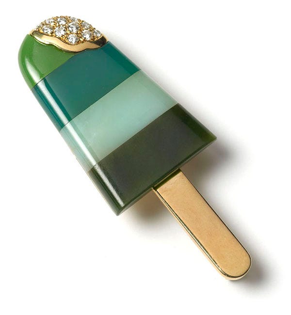
I said in my first iteration of this TEFAF series that I would return to a reddish work at Joost van den Bergh. And since we’ve been hanging out in red hues (before taking a cool green break with that ice lolly!) I thought I’d do that now.
What interested me, when seeing this piece (below) up close, was not only its colour but also its textures. You realise that it’s been made in successive layers. And indeed to paraphrase from Joost’s catalogue:
“After art school, Murukami Tomoharu worked as a painter in the Nihonga style (literally, ‘Japanese art’, using mineral pigments on silk or paper.) He was particularly attracted to Suibokuga (black ink wash painting), but after encountering American abstract expressionism he began to develop a method of building up largely monochrome works over long periods of time - sometimes a year or longer. Each canvas was covered with a black undercoat, then subsequent layers of pigments and oils (primarily blacks and reds) were mixed with charcoal powder and then worked into the painting with a knife, gradually building a thick, textured surface.”
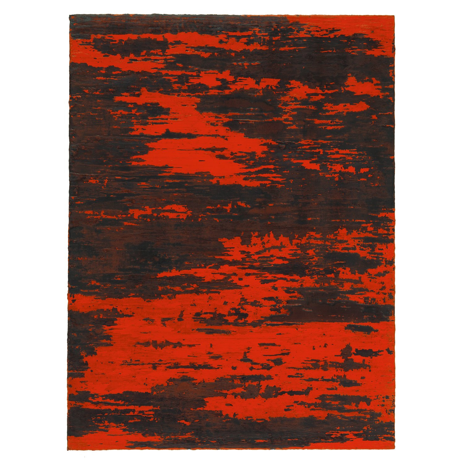
A digital image doesn’t entirely do the piece justice though, because what doesn’t translate is the various layers and textures of fine colour gradations. At a glance the piece presents as basically red and black, but longer inspection shows many more subtle hues of browns, greys, and shades-of-red between those two colours. Additionally, as Joost explained, the piece references traditional Japanese lacquerware - both technically in how the piece was created using many layers over a long period of time, and stylistically in terms of the colours being deployed.
Up until now I realise, the pieces I’ve shown and discussed have all been from the 20th or 21st century. While at TEFAF it’s possible of course to also explore many, many more centuries worth of artworks. So herewith for you, two somewhat older pieces that caught my eye in terms of colour.
Peter Finer
These two pieces are from London-based Peter Finer - specialists in antique Arms and Armour from the Bronze Age to 1900. And they particularly speak to my dealer question, “Have the colours of this object changed over time? If so, how?”
The first, that grew on me the more I studied it, was this rare Tibetan medieval quiver (a ‘container’ for arrows. Think of the elf Legolas in Lord of the Rings). The quiver dates from between the 15th and 16th century. That’s a (principally) leather object that’s five to six hundred years old! It was only once I really got up close, almost with my nose in the quiver, that I saw the inside of it is actually a beautiful deep red colour (of dye? or lacquer? no one could tell me for sure in the moment) that is then layered with patterns in gold. And yes those are green cords that lace it together at various points as well.
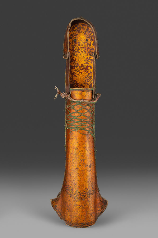

Not only was I curious to know what it might have looked like in its original state, it also opened story pathways for me. Who wore it? One person or multiple people? Was it used for hunting animals? Or perhaps in battles between people?
Peter Finer was also featuring a Greek helmet from the early 6th century BCE. Again however, the photos don’t really do it justice, because its green gives it a special kind of beauty. Of course originally this helmet would have been the colour that is also the name of its metal: bronze. But in this case, rather than the original colours having faded, here they have changed over the centuries to the point that we now get to behold a mottled effect, actually made up of numerous colours when you look closely, giving it the patina that has overtaken the orginal metallic hue.


Is it coincidental that I’m showing you two objects from ancient battles? Not really I don’t think. During the days of writing this post, the European Commission has told its 450 million residents to assemble 72-hour emergency kits to face crises. “To boost our preparedness against potential future crises ranging from natural disasters and industrial accidents to attacks by malicious actors in the cyber or military domains.”
So, there’s that.
And yet… this is Bright Side Writings. So while I’m not going to stick my head in the sand about the paragraph above, I am going to make an active choice - which is to close this post with images of beauty, hope and collaboration, instead.
VKD Jewels
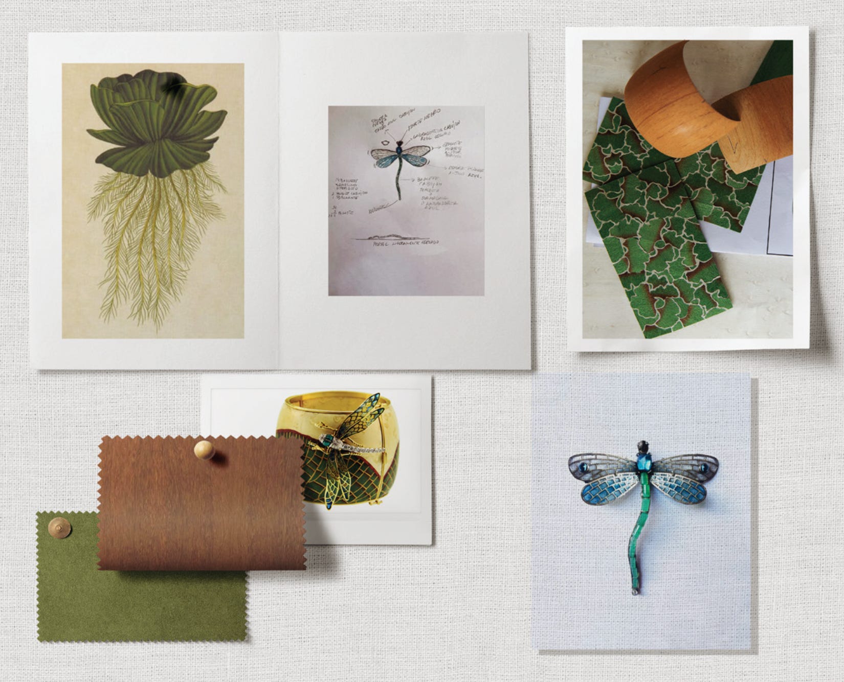
So, let me usher in the final piece in this TEFAF colour series. Which comes to us courtesy of the brilliant team at VKD Jewels - sisters Aimée and Fleur van Kranendonk Duffels, and Fleur’s son Pietro Camilli. This piece is an exquisite, limited-edition clutch handbag featuring a detachable dragonfly brooch. It’s been made as a collaboration between Spanish jeweller Luz Camino and Brazilian designer Silvia Furmanovich. These are two creatives who utilise the highest levels of artistry and craftsmanship while drawing from nature for their inspiration.

Luz Camino’s jewellery creations blur the line between art and nature, and are regularly inspired by organic forms including flowers, insects and leaves. Silvia Furmanovich is best known for incorporating marquetry - a traditional wood inlay technique - into her jewellery, often collaborating with artisans from the Amazon rainforest. Together, these women have created a piece that highlights both their shared love of nature and their distinct artistic expressions, using colours that are widely abundant to us in nature itself. And within that the piece has versatility: the dragonfly can be detached and worn as a brooch on its own, or can be ‘worn’ attached to the bag itself.

Furmanovich and Camino have also incorporated symbolism. In most cultures the dragonfly symbolises change, the perspective of self realisation, mental and emotional maturity, and the understanding of the deeper meaning of life. While the water lettuce signifies the potential of continual growth and abundance, encouraging positive change and progress in life.
Ultimately what I think I most love about this clutch + jewel combination is that, like the Fabergé barberry botanical study that began this post, this human-made creation draws from and represents colours from nature, to give us something that is an exquisite combination of both art + nature.
So, that concludes my writings about TEFAF 2025 objects through the perspective of colour. I hope you’ve enjoyed both the objects and the ideas I’ve tried to explore. Strangely enough though, something non TEFAF-related occurred during this last week, that managed to sum up this colour journey I’ve been on, in an elegant simplicity of two small images.
During a work meeting at Stone gallery (who I also wrote about in A Splash of Colour (In Your Day) Part Two) with my Australian friend and colleague Salvatore, gallery partner Roy Masin slipped each of us a gift pebble of what’s known as ‘tiger iron’. This is a 3.5 billion year old combination of hematite, red jasper and tiger eye that comes from the Pilbara Desert region of Western Australia. So Roy was (super kindly) giving each of us a bit of ‘home’ to carry in our pockets.
For me it was instant love. My pebble has been gratefully ‘in pocket’ ever since. One day, I took a photo of it. (Below left). Lovely. Then the next day I took another photo, in direct sunlight. (Below right). Huh?! How could an object look so entirely different, and gain such new and distinctive colours?! Same iPhone camera. Same ‘no filters’ applied. No dampening or extra polishing involved. Just light. And then SUNlight.
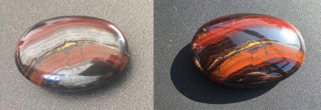
And I got to thinking, sometimes it really is this simple. Whether it’s a pebble, or a colour, or a thought, or an argument, or your face, or someone else’s face - any one of these things can end up looking entirely different, simply when viewed in another light. We might even find there’s totally new information available to us as well. But how often do we view one version of a thing (or a person) and presume that’s the definitive version? How often do we fail to come back the next day to look again? To see what it might look like now, and to find what else we might still need to learn?
I find colours wondrous and amazing, as I find nature and people wondrous and amazing as well. It’s worth remembering that all of us contain hidden colours. Don’t forget to look for them in others. And just as importantly, don’t forget to let all your colours SHINE!
Love and light,
Matthew.
What great works you found Matthew! Not only beautiful but so wonderfully crafted. You natural Australian stones though are indeed real magic. Thank you!
Purpurine; fascinating. I was rather intrigued by a recent article about a new colour named “olo” , a “blue-green of unprecedented saturation.” Apparently only seen after firing laser pulses into the retina and discovered through experiments in understanding the photoreceptors of colour vision.