


A Splash Of Colour (In Your Day) - Part Two
More colour complexities, plus thoughts from Five Wise Friends

New option! Listen along as I read this article for you, out loud!
And then you come around a corner and BAM! Those colours! It’s your eyes that sense them but your soul receives them as they invite you to, “Linger. Stay a while.” But you barely have seconds, let alone aeons – you have to go there and you need to see them so you need to keep moving. But what’s happened here? Those colours have brightened your footsteps, and now with each one you take, your soul radiates joy.
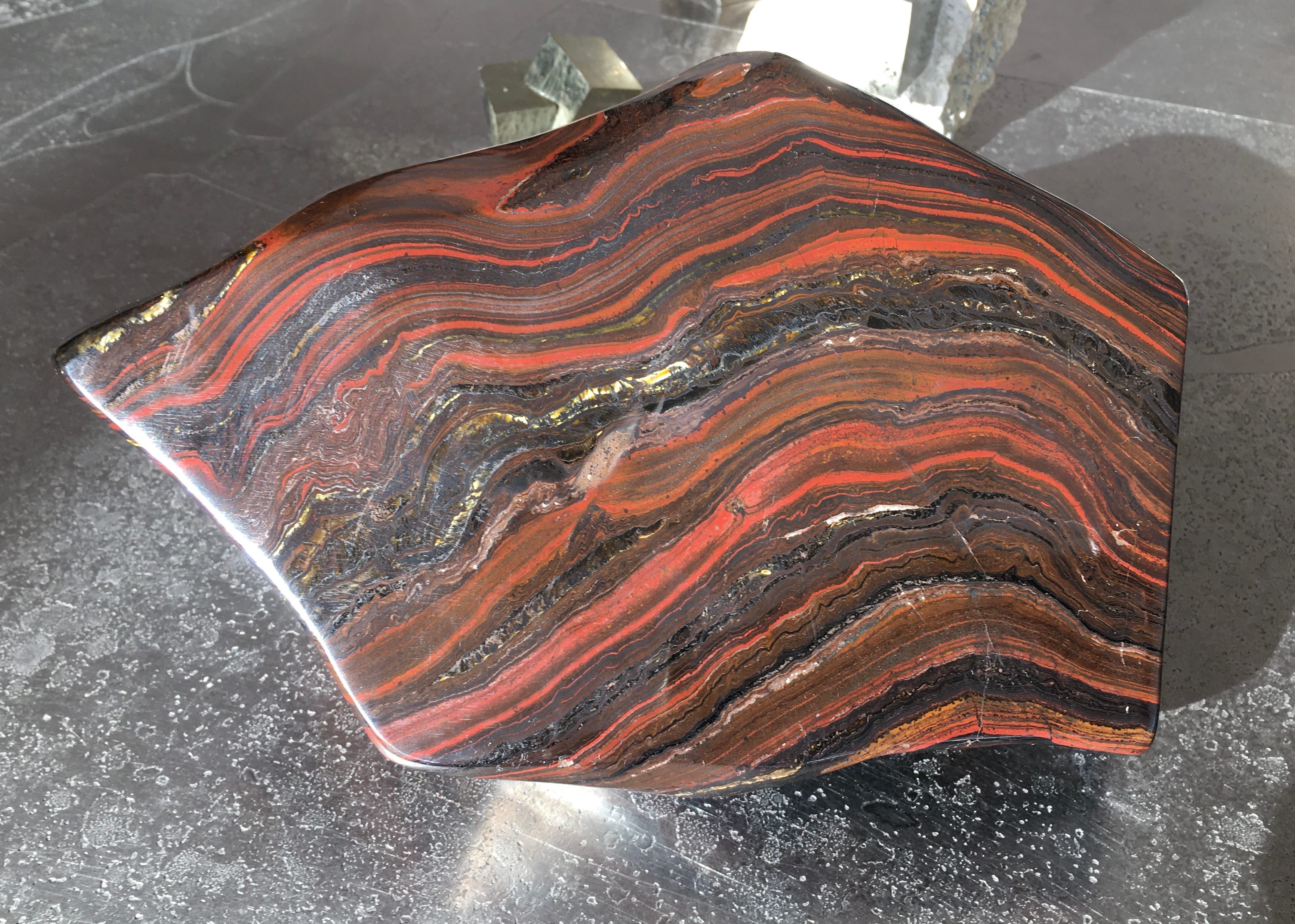
The ‘thing around the corner’ was a huge piece of rock, rough-hewn in shape but then polished and mounted on a pedestal. It was being displayed by The Stone Gallery at an art fair in the Netherlands where I was working with my jeweller husband. Which meant it was two days later before I could finally return to ask, “What on earth IS that?!” Turned out it was a 3.5 billion year-old piece of – what’s known in the trade as – tiger iron.
Gallery owner Roy Masin explained that planet Earth is around 4 billion years old. But this rock composition could only form once oxygen had come into the picture, a half billion or so years later. The colours come from black hematite, red jasper, and tiger eye layered together. And it comes from none other than the Australian desert. BAM! So that’s how this works. On a miserable winter’s day, standing in a fifteenth century church in the middle of the Netherlands, I learn that colours can transport me – in a nanosecond – to my original home on the other side of the planet.
As I wrote about in A Splash Of Colour (Part One), we are all different in how we perceive colours. But through this tiger iron experience I was reminded of how fortunate I am A) to have sight in the first place, B) to be able to see colour complexities, and C) to be able to experience colours in ways that can bypass my conscious thoughts, similar to ways in which a specific smell can ‘transport’ someone to another place and time. (Hard to comment on this as I have virtually no sense of smell myself. Already since a very young age.)
As also previously mentioned, here in Part Two I’m including thoughts from Five Wise Friends: eye surgeon Dr James Muecke, jeweller Ray Griffiths, production designer Andrew McAlpine, jeweller Mart van Drunen and historian Carol Boender. But they all gave me SO much information, I’m afraid I have to divide this yet again into two instalments: a Part Three (already written!) still to follow today’s Part Two.
Referencing point A) just above, I’m starting with Dr James Muecke, who has spent his entire working life helping to improve sight and prevent blindness in people all over the world. James and I were best friends at high school in Australia, and when I sent James a few questions around the idea, “In what ways do colours affect and influence you in your daily life?” he answered with this.
“The images are not clear – what you see of a day is what you see of a night. There’s no clarity. I see people or animals or trees as just black on a greyish background.”
Neil woke up one morning at the age of 50, blind in both eyes. Diabetes had robbed him of his sight, and with it the extraordinary colours and beauty of our world. And the sad reality remains… it didn’t need to happen.
90% of the world’s blindness is avoidable. Colour should be enjoyed by virtually every person on the planet. It should be a given. The opportunity to give people back the ability to appreciate colour has driven my work in fighting blindness for over three decades. Colour means everything to me.”
Talk about a clarity of vision. That’s James in a nutshell, and apparently the universe agrees. He was chosen as the Australian of the Year – 2020 – which is also shorthand for ‘perfect vision.’ James used his platform that year, and since, to bring wider attention to Diabetic retinopathy – which is a leading causes of blindness worldwide, and the leading cause of blindness amongst working age adults in Australia.
(You can see more about Neil Hansell’s moving and impactful story on this page.)
James lives his love of colour in additional ways out beyond his work as an eye doctor. He is also a skilled photographer and shares his iPhone-captured experiences of the world via Instagram.


Together with James and a wider team, I am presently in the midst of creating a website for the Diabetes Impact Network. It will provide all kinds of information on how the elimination / minimisation of sugar, ultra-processed foods, carbohydrates and seed oils can reverse type-2 and improve overall health (including eyesight).
But until that website is ready (and also afterwards!), if you’re in a position to be able to help, please consider supporting the foundation James co-founded, Sight for All. By training doctors on the ground in different countries, and delivering much needed direct care, Sight for All has successfully transformed the eyesight of millions of people since they began operations in 2009.

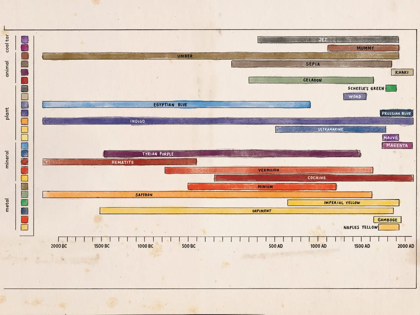
Since posting Part One, I’ve continued to learn about, and find different ways of understanding some of colour’s myriad complexities. Case in point: this illustration I chanced upon, that makes colours themselves, their names, and their times of popularity in history, all make sense to me, visually. A helpful discovery!
And clearly, some of you reading here have also been triggered to pursue more information about colour – which of course I love! One old school friend, John Horniblow, even took another look at the current Mark Rothko retrospective in Paris. Some of his beautifully articulate observations include that Rothko saw colour as, “merely an instrument for greater emotional expression,” and that, “instead of ‘painting colours’, Rothko was actually exploring light, through the expressions, vibrancies and luminosities of colour.” Fascinating. Which brings me to what follows.
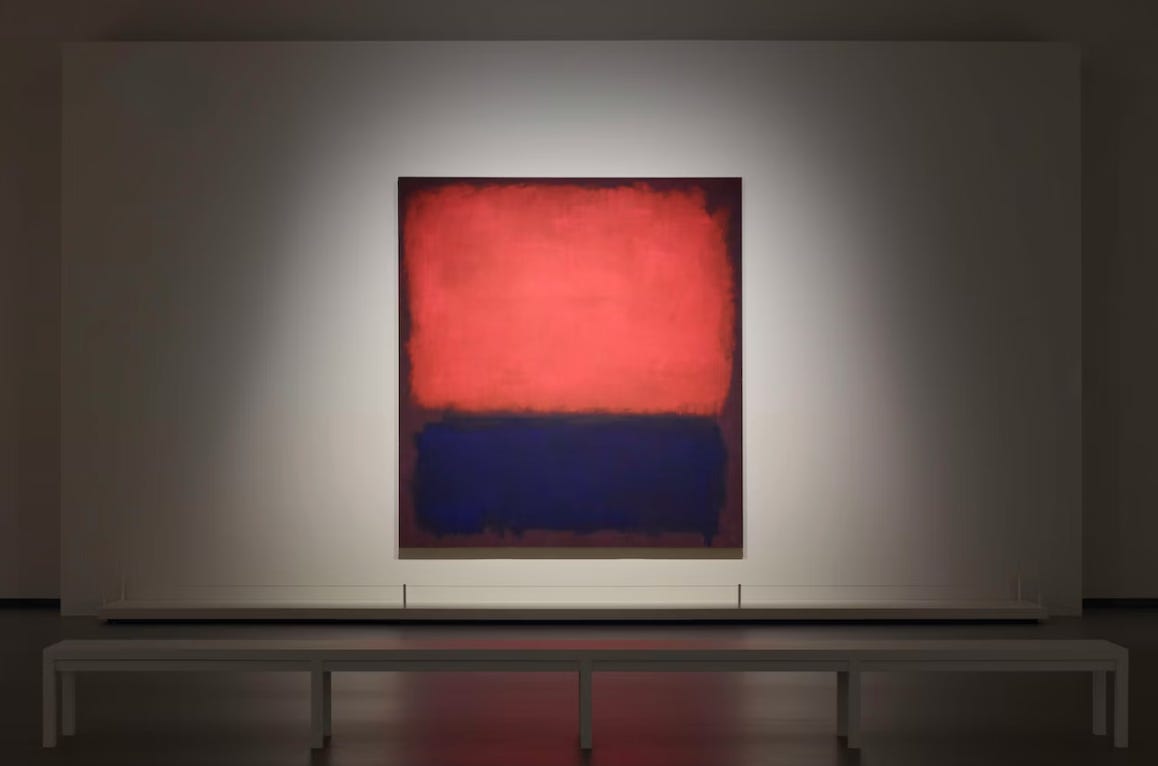
(I thoroughly recommend reading John’s observations, which you’ll find simply by scrolling all the way down to the Comments at the end of Part One.)
As humans we’re able to process and discriminate millions of different colours – quite extraordinary if you think about it. However, our perception of colour is not created at the moment of vision – it is created through an instantaneous and ongoing ‘exchange of information’ process between the eyes and the brain.
Initially, our eyes provide sensory signals about objects in our environment and their properties, such as colour, gloss, shape, texture, and transparency. Then, psychological / neurological processes transform this sensory data into experience and subjective evaluation. So, colour is in fact a ‘psycho-physical phenomenon,’ which means colour perception is far more complex than our eyes (and brain) simply measuring an object’s colour values. Human brain colour perception can be altered by factors like favourability – does an object draw us in or repel us? Is it beautiful or hideous? Does it appear to be superbly crafted, or slapped together? All these factors can contribute to how we (individually) perceive that object’s so-called ‘colour.’
To truly ‘measure’ a colour, you’ll need either a colourimeter: which expresses the percentages of red, green and blue light wavelengths reflecting from an object – to an observer in a specific position. Or a spectrophotometer: which measures an object’s hue (dominant colour), chroma (colour intensity or vibrance), and lightness – and calculates these into a far more precise reading than RGB percentages can deliver.

(I gleaned various bits of information here from a fantastic Learning Centre about colour within the website of Datacolor. It contains many pages, but I suggest you start here.)
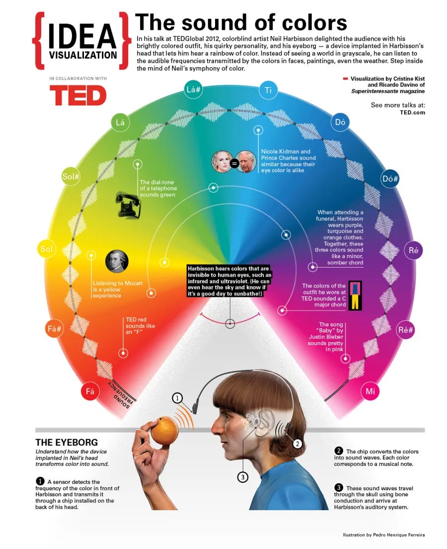
Talking of colour measurement, a few years ago my talented creative director friend Chris Baylis invited me to accompany him to a talk/presentation from ‘a colour blind guy with an antenna.’ I trusted Chris enough to feel this wouldn’t end up being as bonkers as it sounded. Or that perhaps it would! In the end… I know the phrase ‘mind blowing’ gets overused these days, but it does kinda’ describe what we encountered.
Neil Harbisson is a Catalan-raised British-Irish-American cyborg artist and activist for transpecies rights. While the majority of colour blind people have a lack of sensitivity (in the cones behind their retinas, not their rods – check Part One if this makes no sense!) to either the red, green or blue wavelengths of light, a small percentage, like Mr Harbisson, are born with achromatopsia, meaning they can only see in shades of black, white and gray. Harbisson has never viewed this as a disability (his night vision is excellent, and he only needs black & white photocopies – cheaper than colour!), but was always curious to understand various different dimensions of sight. In the noughties, this led him to convince a doctor (whose name remains undisclosed) to surgically implant a camera-antenna in his skull. (And Yes he sleeps, travels and bathes with it, and No it does not detach.)

While his first antenna allowed Harbisson to ‘hear’ the colours of the visible spectrum – by converting light wavelengths into sounds that are then transmitted to his auditory sense organs via bone conduction through his skull – once things were going well, he then upgraded his antenna to also be able to process the non-visible (to the rest of us!) wavelengths of infrared and UV. A handy feature, he points out, for assessing the UV-weather, prior to any sunbathing. Downside: it can also make a peaceful walk in a forest unexpectedly ‘noisy’, if many ultraviolet flowers are blooming at the time!
Clearly, the addition of his antenna has opened up Harbisson’s ‘view’ immensely. Does he now ‘hear’ colours? Yes and no. He says he ‘senses’ them through a sortof combination of sight and hearing that he prefers to think of as a sixth sense. And he’s a bit bewildered at all the apps and software devoted to increasing ‘intelligence.’ Harbisson asks, why not work at augmenting and expanding our senses, instead? I find this a wonderful question.
And yes I know I’ve been banging on for months about the benefits of trying ‘a different view’, but how’s this one? When Harbisson attends a funeral, he wears purple, turquoise and orange clothes, because these three colours combined sound like a somber, minor chord. I love that in Harbisson’s view, he is still paying his respects at a funeral by ‘appearing in a sound that matches the occasion.’ I think I deserve to say it now: mind-blowing!
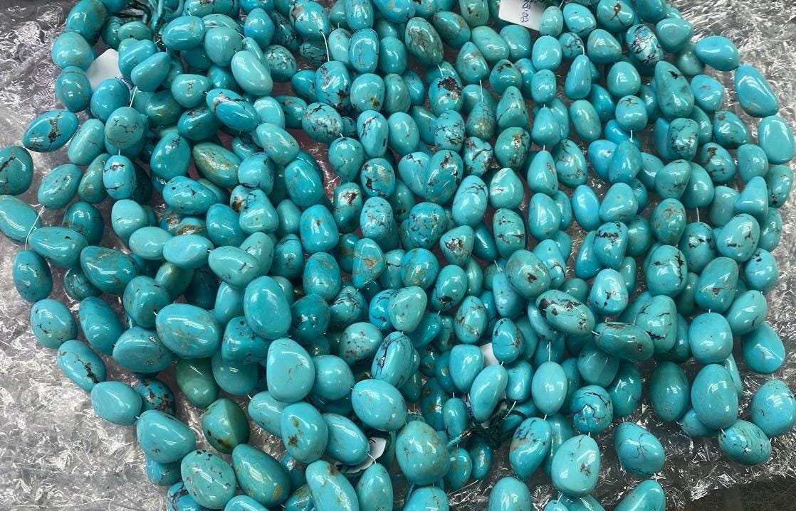
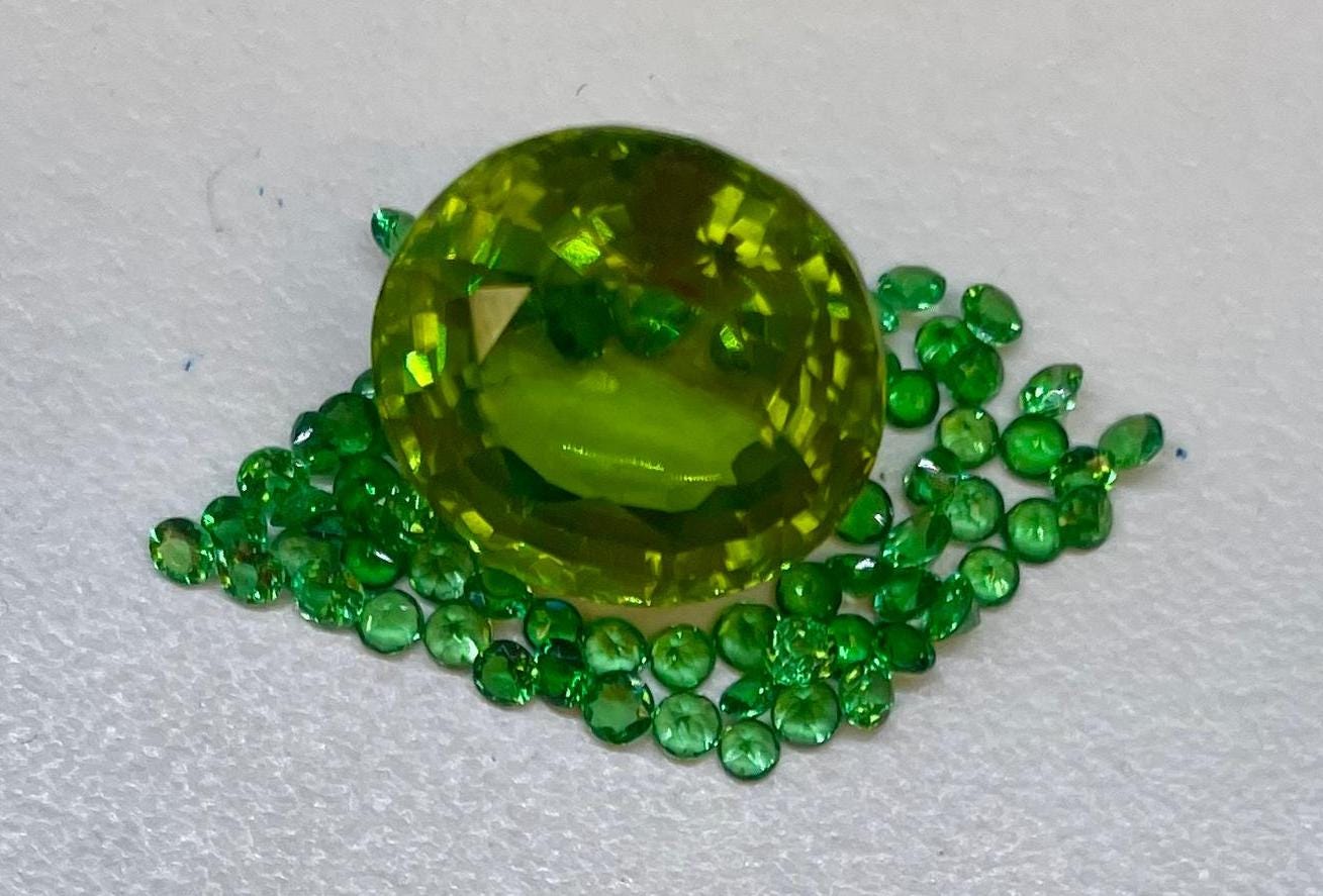
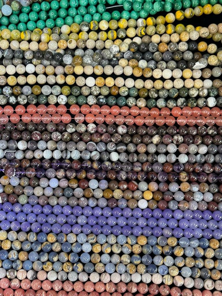
So, another of my Five Wise Friends I spoke to was Ray Griffiths, an Australian-born jeweller / gemologist who for many years already runs his business Ray Griffiths Jewellery from his studio in Manhattan, New York City. We met back in Sydney, in the ‘80s. When I asked Ray for a few thoughts, his immediate answer was:
“OMG colour is my forte in the jewellery world. It makes people so happy! People still love diamonds but that market is turning upside down because of lab grown stones, so folks are turning to the colour of natural stones. In colour, turquoise is a good example – it’s so vibrant it’s hard to believe it’s natural!”
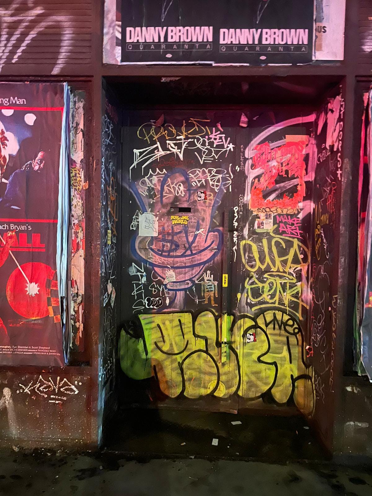
As far as colour inspiration, for Ray? Basically, from everywhere, because he is always ‘paying attention.’ He shared this next photo with the note:
“I took this pic on the Bowery last weekend, simply because I loved the colour and it’s so New York.”
MC: “Was there ever a time in your life that was drab or devoid of colour? How did you go about bringing colour back into your life?”
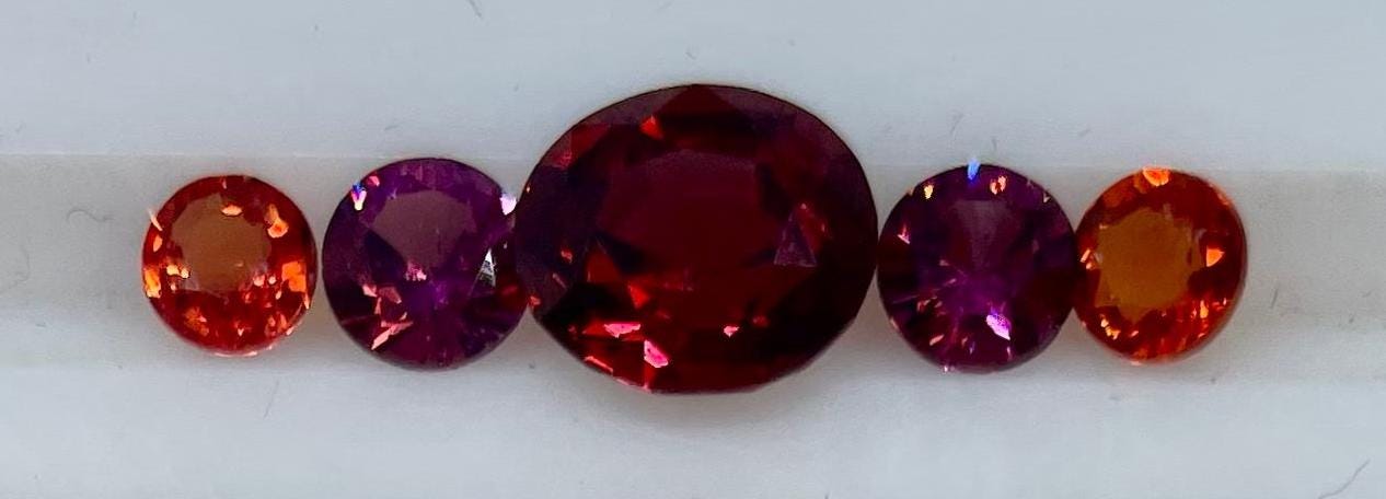
“Many times like that. But I’m a part time meditator so I can close my eyes and bring in colour with my imagination. Sometimes I might need to bring in the colours of the water in Sydney, but mostly it’s from seeing the natural colours of nature, or doing what I’m doing right now – me in one of my (very) happy places – selecting coloured stones at the Tucson Gem and Mineral Show.”

And that’s a wrap for A Splash Of Colour (In Your Day) - Part Two. I look forward to sharing Part Three with you in the coming days!
Love and light,
Matthew.

I look forward to part 3. Another old schoolmate would have a lot to say about colour too: Narayan Khandekar, at the Harvard Art Museum is quite literally an expert on paint colours.
https://mittalsouthasiainstitute.harvard.edu/people/narayan-khandekar/