


A Splash Of Colour At TEFAF 2025
Deep (and shallow!) dives into exhibition pieces, through the perspective of colour

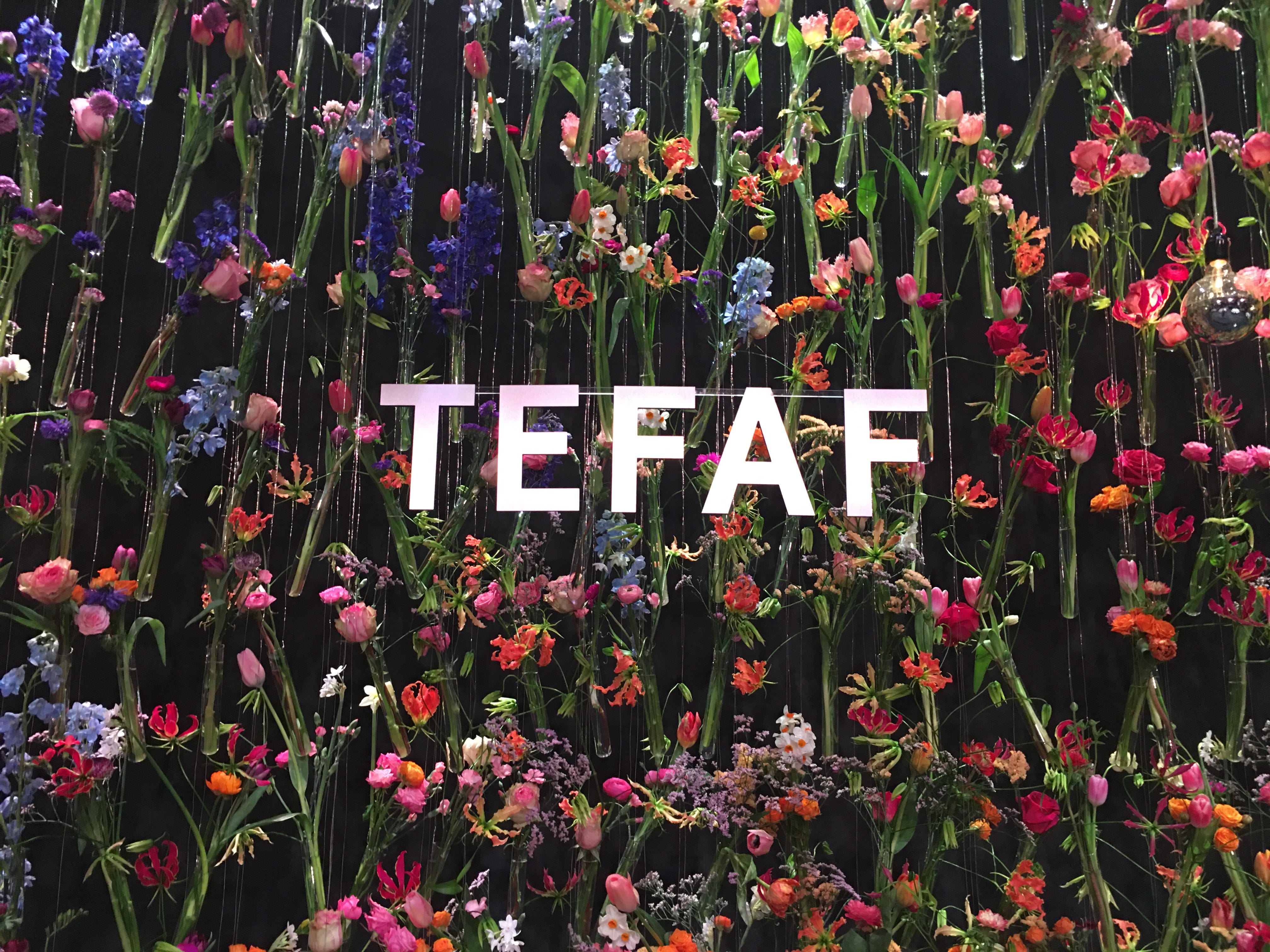
This week and next I’m in one of my (very) happy places: Maastricht, the Netherlands, while both working at and attending TEFAF - the world’s leading art fair. In fact, this is my twentieth year of attendance. And two decades have ‘rubbed off’ on me in all kinds of ways. One thing I have gained is knowledge - about different art forms from a range of periods and styles. But another is a wide selection of people, many of whom have become friends; including dealers, artists, visitors and support staff. And I’ve come to realise what a privileged position I’m in to experience this each year.
I think there are two things you can do with privilege. One is to sit, get fat, and gloat. The other, that I much prefer to do, is to try and share my privilege outwards. So, what follows will be my attempts, through words and images, to share some of my TEFAF experience(s) with you. And this year, I’m choosing to explore TEFAF exhibition pieces through the perspective of colour. Why? Let me, briefly, explain.
In 2019, I wrote Has Your Brain Crashed Lately? Then View Some Art to Reboot It. In this I briefly discussed art viewing, from a neuroscientific perspective. Our brains perform best when we allow them to sense, and then feel, and then think. So looking at art - like, really looking at art; not ‘snapping a selfie with the Mona Lisa’ - is a really good and healthy workout for your brain. And so in that piece I take readers through a bunch of TEFAF artworks, while keeping this ‘way of seeing’ in mind.
At the time, readers really responded to the fact that instead of exploring TEFAF through the usual channels of ‘money: the financial ‘worth’ of a piece’ or ‘importance: the historical/academic ‘provenance’ of a work’, I had chosen something more accessible. What do you sense, feel, and then think when you view an art work?
Then during last year I wrote A Splash Of Colour (In Your Day) - Part One, Part Two and Part Three in which I made some pretty deep dives into the history, linguistics, chemical science and social science of colour. And in Parts Two and Three I included interviews with Five Wise Friends: an eye surgeon, a colour theorist / historian / art lecturer / two jewellers / and a BAFTA-winning film production designer. I enjoyed these investigations so much that I thought: why not expand upon that by interviewing dealers and artists at TEFAF about specific pieces through something totally accessible? Again not money or provenance-related: the perspective of colour.

I hope you’ll enjoy the pieces that follow. My plan is to release a new story every few days during TEFAF. So, please note that you will receive two or three different emails from me during the coming ten days or so. Also fine to save them to read at later dates!
Joost van den Bergh - TEFAF Stand 156
When I asked the charming Dutchman-based-in-London Joost van den Bergh to talk me through one or two pieces of his pieces, through the perspective of colour, he at first apologised that he hadn’t had a chance to think about my emailed questions. But once we got talking in his stand (during the last pre-show, set-up day) he became totally animated and I think we could have continued for another hour at least! Here are two of Joost’s blue pieces. (I’ll return to red in a later post.)

Joost: “I think this is an extraordinary piece - it’s the largest piece this (still living) artist has ever created - not only for its shape and size but also its electric blue which merges into shades of green, with even some gradations of violet in between.”
Furuno Yukiharu is famous for the ceramic pieces he creates in various shades of blue - including his most recent ‘Royal Blue’ series which has won a number of awards. When he began, he experimented with different kinds of ash he would get from different kinds of plants, to contribute to the colours of his glazes. And he continues to experiment with developing glazes to this day.
This aspect of an artist developing their own colours is something I’ve also heard from the British ceramic artist Kate Malone (whose work I will profile as well in the coming days). Kate shared with me that this is a lifelong project of hers: constantly experimenting with ingredients and combinations of elements in order to develop different colours of ceramic glazes. As time has passed, Kate has assembled her own ‘library’ of colours she knows she can return to and rely upon to produce particular colours during and after the ceramic firing process.
Furuno Yukiharu has stated that although each shade of blue he has worked on has its own special qualities, blue as a whole represents ‘the calmness and beauty of the sky, ocean and the depths of the earth.’


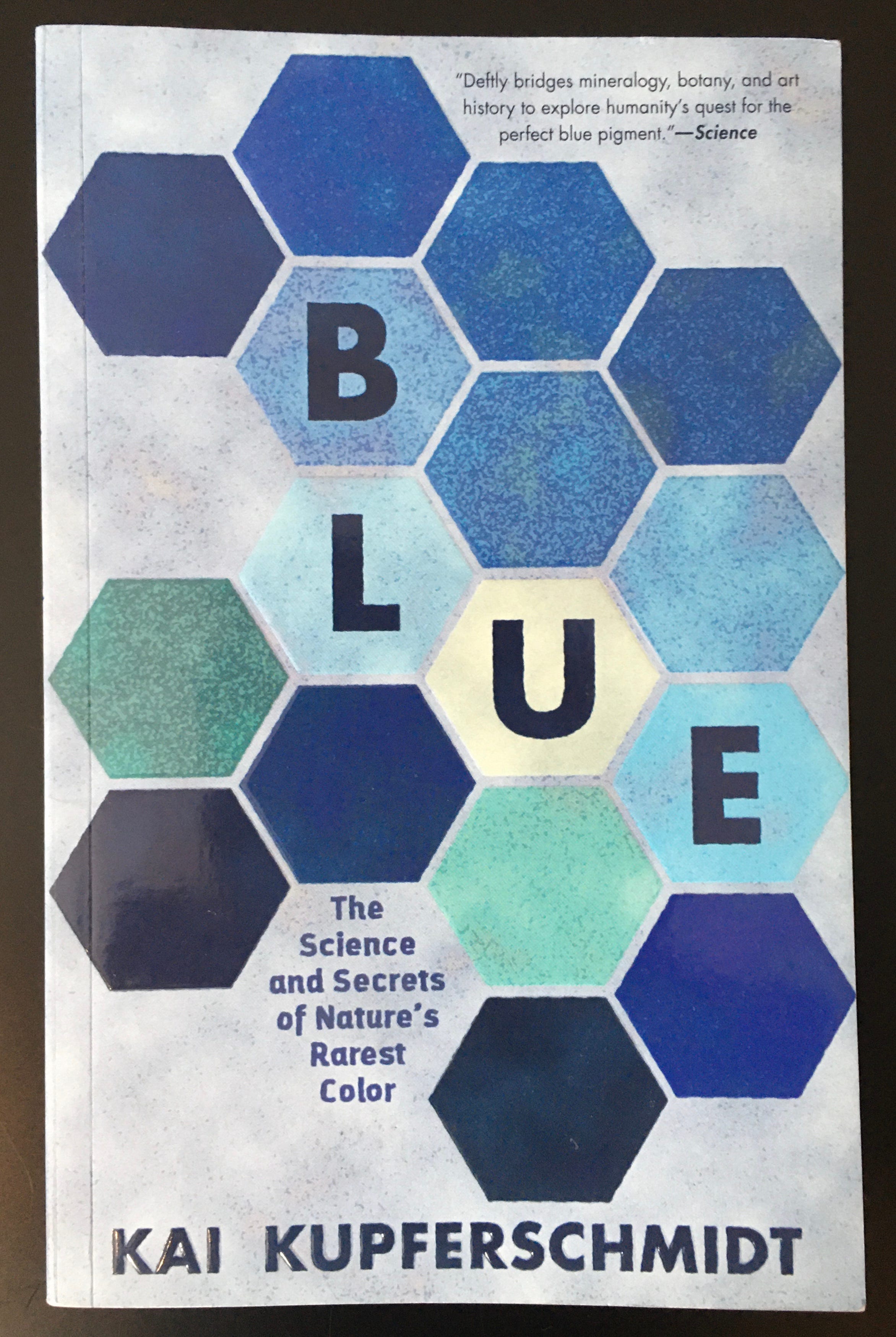
Blue is an incredibly special colour in the world - it’s our favourite colour globally - across races, genders and ethnicities, blue always comes out on top. And yet, although it’s there in the sea and the sky, blue is a true rarity amongst creatures, plants and minerals. And the few of those that appear blue are almost always deceiving us. You can find out a lot more about blue in the following, fascinating book. Blue - The Science and Secrets of Nature’s Rarest Color - by Kai Kupferschmidt.
A. Aardewerk - TEFAF Stand 238
The lovely, friendly and knowledgeable Esther Aardewerk at A. Aardewerk, supported this sentiment of blue being a favourite colour when she showed me the following. An extraordinary, French, 18k yellow gold, Art Deco brooch featuring a 100 carat, pure as pure aquamarine, plus a pair of 18k yellow gold and turquoise earrings by Angela Cummings.
Esther: “Although aquamarines can come larger, this is still considered a large stone. And I love the colour because it’s a beautiful, watery, summery-spring, blue colour. And it makes you happy! As does the turquoise. So for this season, I prefer this colour.”


Personally, in addition to the size and quality of the stone, I love that the aquamarine is only ‘bordered’ by gold on two sides: the top and bottom. In this way the scroll formation of gold, to me, seems to somehow recede into the background on the left and right sides, leaving the stone to stand by itself. Imagine for a moment if the stone had been bordered on all four sides. Don’t you think that would have given a totally different effect?
S J Phillips Ltd - TEFAF Stand 154
And for a different season altogether, the gentlemen at S J Phillips Ltd were kind enough to show me the following. A brooch of holly leaves and berries, with diamonds and rubies. And an Art Deco ruby, diamond, sapphire and demantoid garnet open rectangular brooch, French, of buckle design with central band of geometric vari-coloured gem flowers.
I loved Rodney Howard explaining to me that, previously, SJ Phillips had a different-but-similar version of this holly brooch, that had pearls, as white berries, instead. Rodney: “While the white was beautiful, the piece as a whole didn’t POP the way this one does - and of course this also screams: Christmas! But yes, with the white, the pearls somewhat merged with the diamonds and didn’t give nearly such an exciting effect.”
And then what is unusual about the colourful brooch is that it is using exceptional quality demantoid garnets - which were more commonly expected during Victorian times, but not in this quite late Art Deco period.


Okay, well I hope this has been both a bit enjoyable and informative for you. And I already have a whole bunch more of exciting pieces to share with you, across a range of colours, periods, forms and styles, in the coming few days!
Until then, love and light,
Matthew.

Matthew, this is the coolest thing ever. Viewing art in books and online, and writing in response to art, has helped me through the healing process of converging chronic illnesses in the last six months. I'm so glad you're writing about this--and sharing your experiences.
I love that Yukiharu blue !