


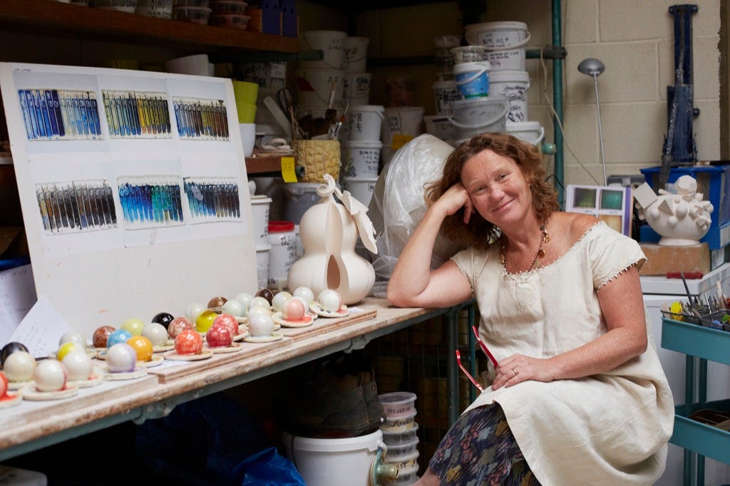
A Splash Of Colour At TEFAF - 2 - Kate Malone
A deep dive interview with ceramic artist Kate Malone MBE. How she thinks about and uses colour in her work process.

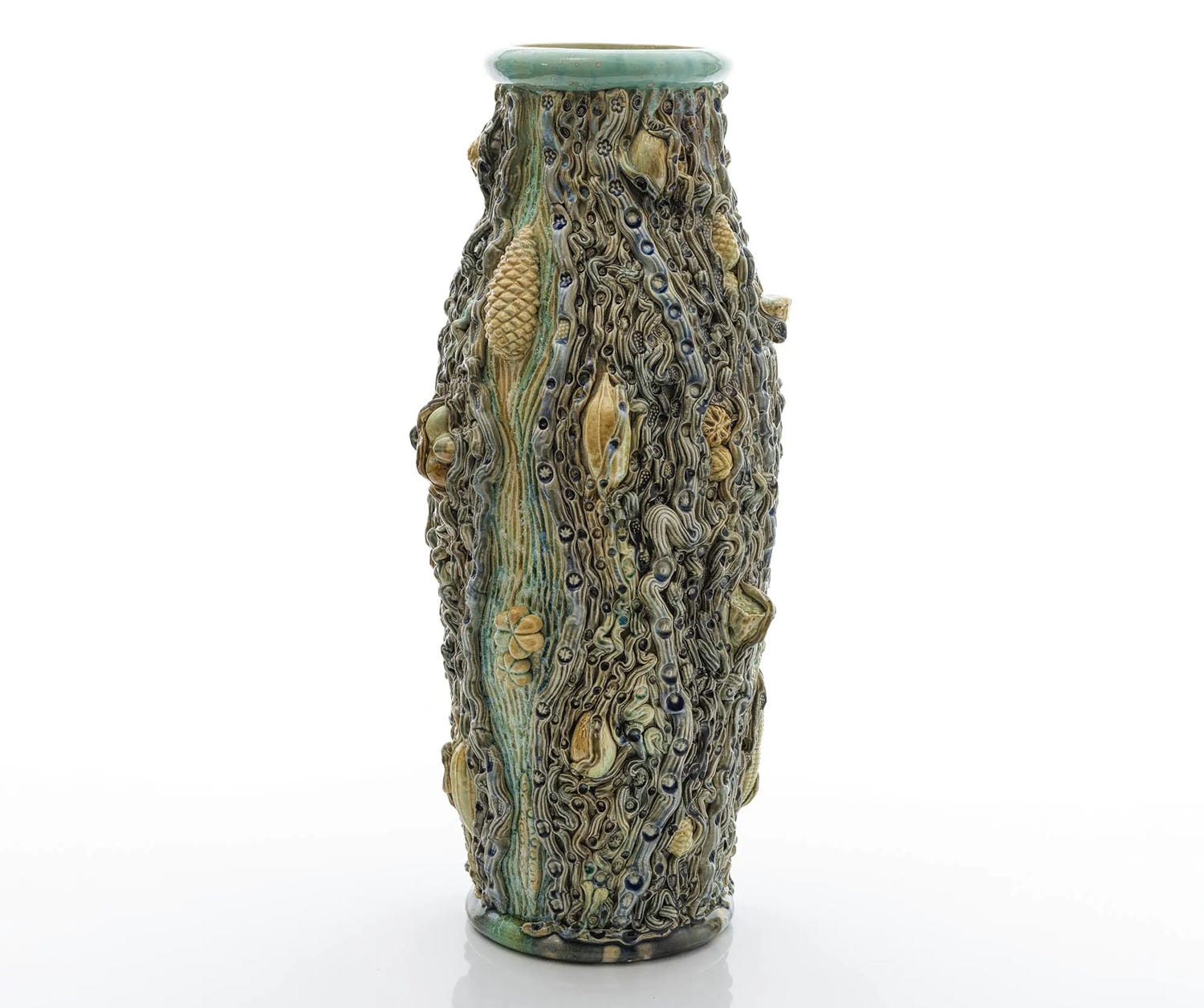
I began A Splash Of Colour At TEFAF not quite knowing where it would take me. Because that’s just fun, right?! Well, in today’s edition Kate Malone, who is represented by Adrian Sassoon, gave me a wonderful interview (on the floor of TEFAF), initially discussing the vessel shown above.
By way of a short introduction from Adrian’s website:
“Kate is one of the UK’s leading ceramic artists with an illustrious career spanning thirty years. She has developed an unmistakable and highly regarded style, evidenced by her unique, hand-made pots and intricately ornamented sculptures.”
And perhaps it’s no small wonder we found various connections through this interview. Me with my ‘optimism-led’ Bright Side Writings, and Kate with this:
“In my ceramic artwork I am inspired by the optimism and joy in nature. My highly-coloured, natural forms brim with a sense of growth and abundance and aim to communicate the 'Life Force' to the viewer.”
I hope you’ll enjoy our conversation, which has been edited for length and clarity.
Adrian Sassoon - TEFAF Stand 254
Spotlight on Kate Malone
Matthew: So as you know Kate, I’m writing this TEFAF series. Could you perhaps talk me through one of your pieces, through the perspective of colour?
Kate: Certainly! So, when I make a piece, I don't necessarily think this is going to be striped or this is going to be green or blue or black. Because in ceramics, the processes of making and glazing, especially with a large piece, are quite removed. They can easily be a month or two apart because there’s drying time. So, I might be making something and think, oh, this would be lovely in greens. But I don't necessarily hold that in my head. It's when it comes out of the kiln pure white biscuit or slightly off-white, that I then look at it and think, what am I interested at the moment? Why? Where might this take me? And it can be as simple as seeing different glazes I've mixed recently – I might have been researching greens or blues – and they'll be on the table, and so I'll use them.
Matthew: May I ask, when a piece comes out of the kiln, white like that, is that almost like: now you've made your canvas?
Kate: (Thoughtfully) Yeah… Yes, it is, really!
Matthew: Because in a similar way, I sometimes say to writers I work with, “As writers, we don't have a canvas or lump of clay or a piece of metal. We have words, and usually you have to put a whole lot of words onto a whole lot of pages to first create your canvas or your block of wood.”
Kate: Yes! And then you start shuffling those words around.
Matthew: Indeed! Shuffling them around, or taking them away, or changing them in various ways. But I hadn't thought about that for your process, about that ‘naked’ form (which has also been your creation) prior to the glazing process – that that is something akin to your ‘blank canvas’.
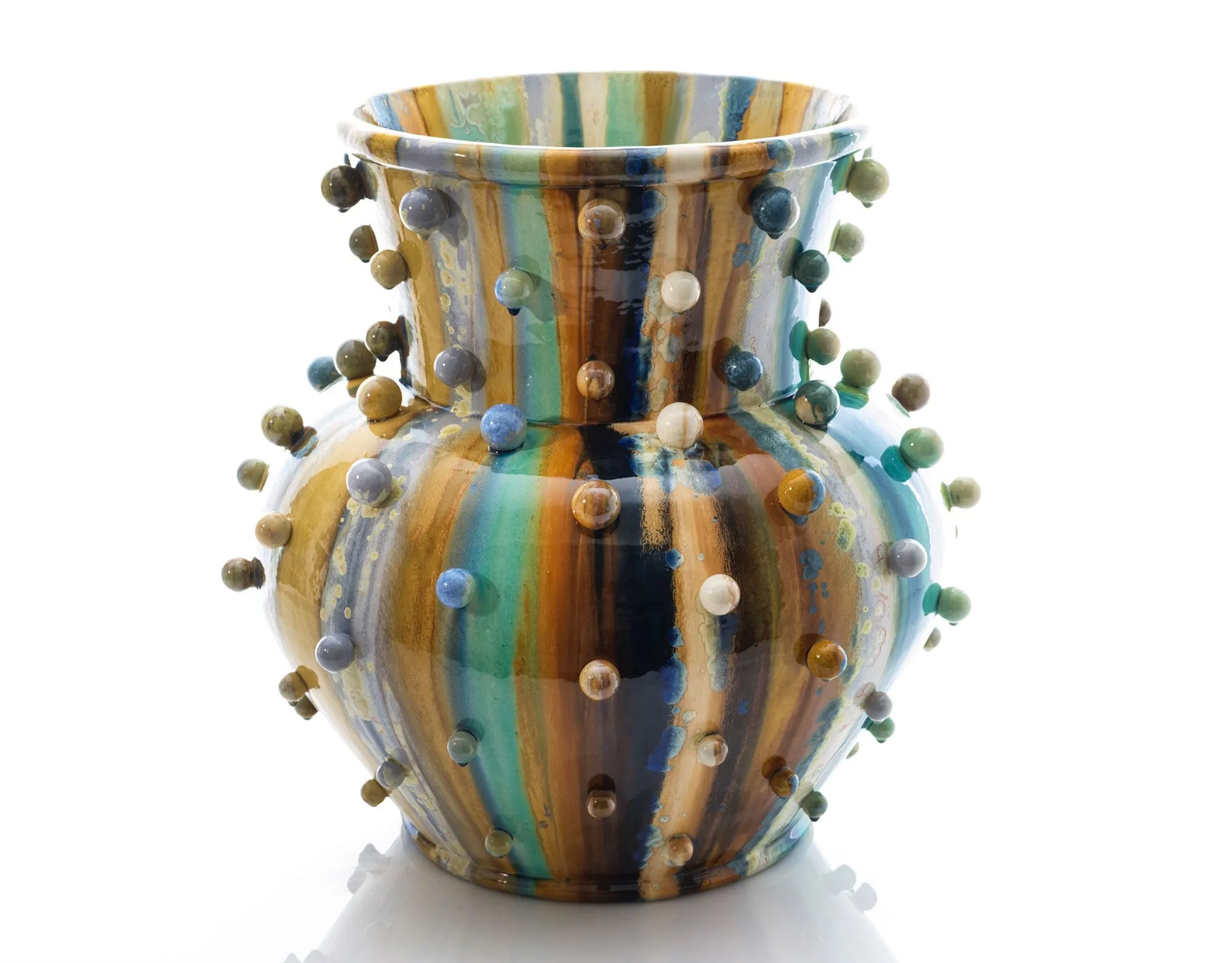
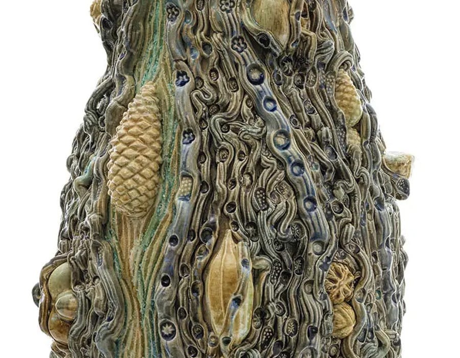
Kate: And even the words that you're thinking about at the moment; you're learning new words and you're relating words and having strings of words. Similarly, it can be that I'm researching antimony or molybdenum, and I have a certain palette on my desk. And that, of course, will influence things. Also, I might be reading about the flow in the xylem in plants and the energy in nature, and I'll be thinking about colours for that. But essentially, the thing that interests me about this piece is I actually randomly took glazes that I had on the table, if you like, from my big, huge wall of buckets of glazes. And I thought, okay, I know blue to turquoise is so beautiful, and then I'll turn it to greens, and then I'll add this opaque green. (Fig. 1, below) So this is a mixture of transparent colour and opaque colour, which behave very differently. But to me, it's the chance overlap. So when I put the glazes on, I overlapped them. I didn't butt them up to each other. They were overlapped. (Fig. 2, below)


And so what we're getting now are… surprises. And that's unpredictable where the overlap happens. To me, it's the unpredictability of the way that colour relates to form. So... when you're talking about words on a canvas, or painting on a canvas, that, to me, is two-dimensional. Obviously, the words bring a dimension to everything, as does paint. But in a way, to me, if I can make the glaze or the colour relate to the form in a meaningful way, because that's quite difficult because there are such different processes involved. And again, it's movement.
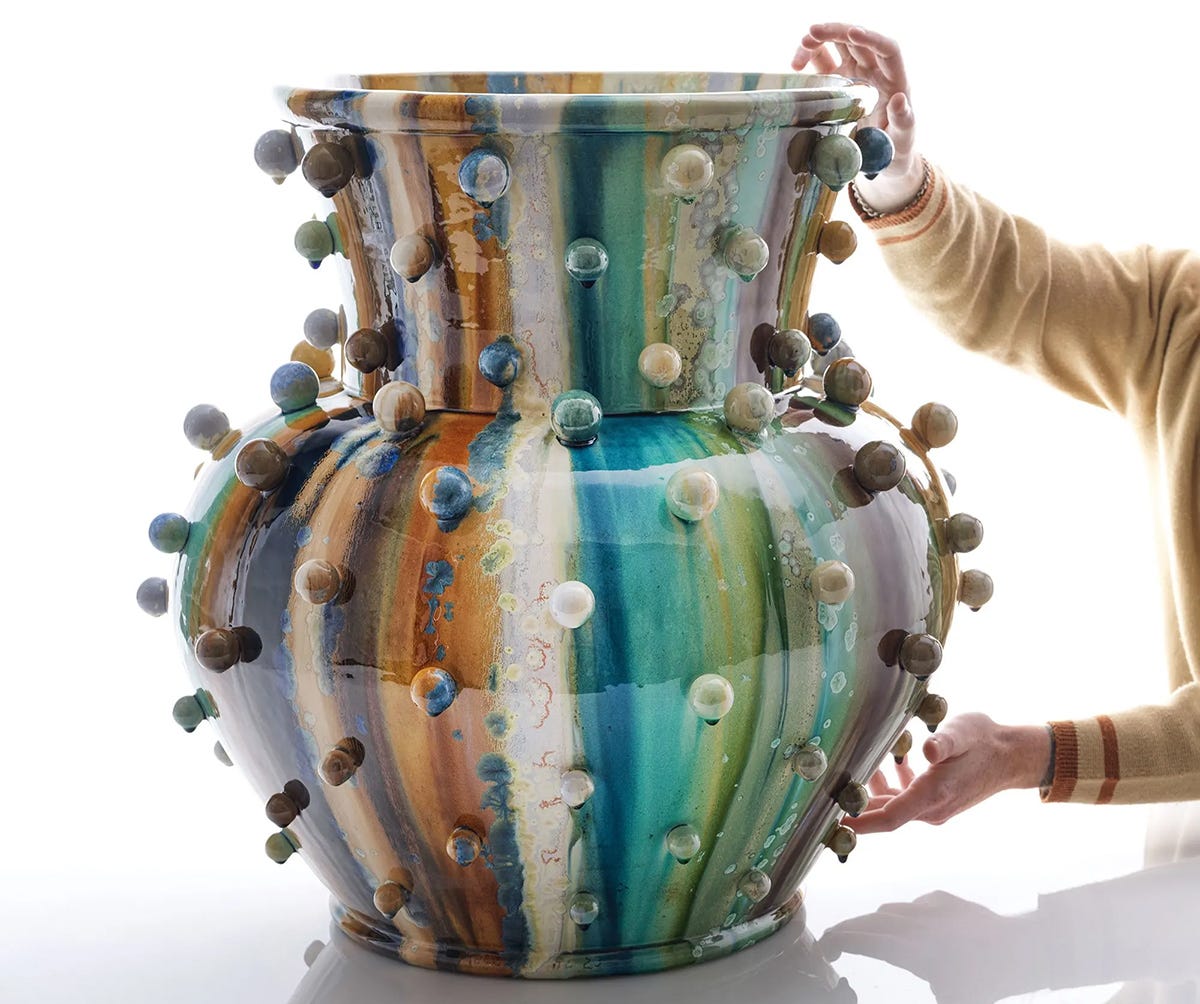
On this piece, everything is dripping off every ball. (Fig. 3, above) So I put it on extra thick at the top. And I know, well, I know this is going to come here. It might get affected by this. It didn’t – it did get split by this and then divided and it moved down. But this was a different colour underneath. So to me, it's the surprises. So the interface between this green and this opaque colour has given me this shading. I haven't done that. That's happened in the kiln. And the same applies here, where there's this amazing oily rainbow where there's an opaque part, and I'm observing this as I speak to you, because I'll take that forward into the next piece. This opaque glaze next to this transparent glaze – there's this strange interface. And I suppose you might say the same for a water colour artist or even a wordsmith. You put words next to each other and these other words come up.
Matthew: Okay… but if I may, I would like to interrogate your use of the word “surprises!” I would venture that you have far fewer surprises because of your extensive experience, no?
Kate: No!
Matthew: Really?! But okay, so you said you have an idea that blue to turquoise and then green will look great together, and will work…
Kate: Yes, that that will work – but that is just a starting point. Like a wordsmith, pulling out a few words in a sentence, not knowing what's coming ahead. I'm more interested as I get older in taking risks. And so the overlapping and the movement is all really important.
Matthew: And then what's happening with these crystals? Is that also a surprise? Or is that slightly calculated?
Kate: No, I know the crystals will grow. So, as well as playing with a huge palette of colour, opaque and transparent, and using minerals – these are all natural minerals; iron, copper, cobalt, manganese, vanadium, and things like that – I actually grow crystals by supersaturating the material at very high temperatures, and they grow in the cooling cycle. So, in the same way as a lump of coal, which is a crystalline, you pick it up, it's like a crystal, actually, or a diamond, or any other crystals that you'll see in natural history collections, very fine things – I simulate that in the firing and the ingredients of the glaze. Every glaze has a recipe, and all these recipes are high in zinc. So, there's a huge possibility that crystals will grow.
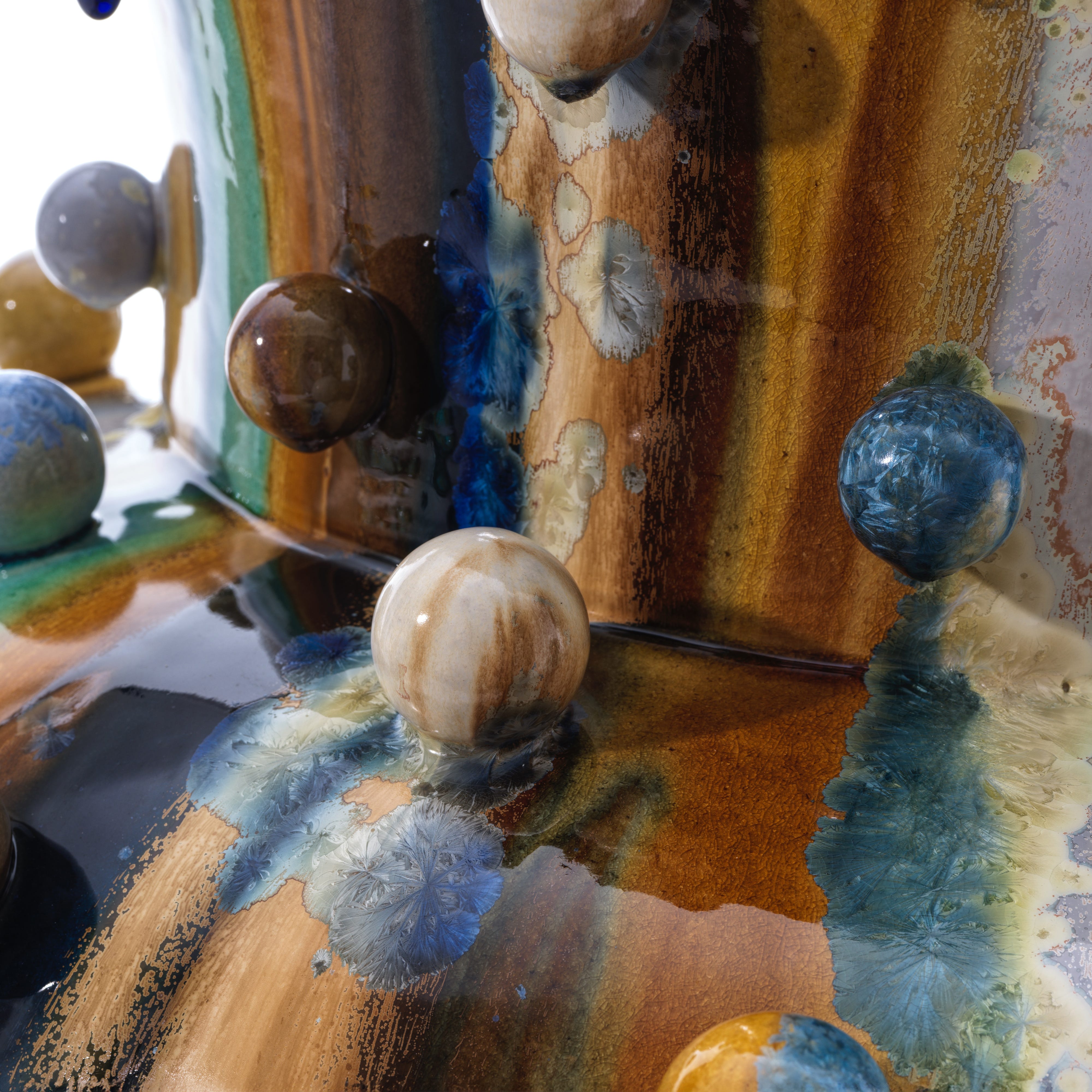
And here we have a crystal that has split – I’ve never had it before! (Shown above) You've got one side of it is one colour, and the other side of it another. So, you never know how many crystals are going to grow or where or the start is. And you can control it by cooling slowly and rising and cooling and rising, much like a diamond or an emerald grows in the Earth's crust over years by that, so you simulate that. So, this has been very high fired to get movement of colour and glaze and to start seeds. And every crystal has a seed. So you'll actually feel the centre of the seed actually has a crystalline strand. And they nuclei and collect colour around them and crystallise. And of course, crystal is bending light, which is colour, isn't it? There are so many parallels, aren't there?!
Now… I have another piece I’d like to show you if you're interested?
Matthew: Duh! Yes please!!
Kate: This piece was so experimental. When I started, I had no idea how I would make it. I simply had a feeling that I wanted to interpret onto a surface. I was going to do something quite formal, but the clay was too soft for that, and normally I just wrap the clay up and wait… plus it was late at night. And I'm very into the phloem and xylem flow combination, which is the energy that is just under the skin of every plant and tree. The centre of a tree is dead in effect. You snap a cowslip in the country and it's hollow. Huh? Wow, it's hollow! It's all going on in this skin. And in fact, a pot is a skin, isn't it? It's the skin that holds space and energy. I was learning about the phloem and xylem and the way the phloem takes moisture up out of the soil, through the roots to the leaves and evaporates. And then the xylem comes up and collects all the sugar from the photosynthesis and distributes it around the plant. So, this piece is very much not about colour, in effect. It's more about movement and about the fact that there's this super highway of energy that goes on in a plant that we're quite unaware of.
Matthew: For sure. So, did you know we still haven't figured out how a tree gets so much water up and into its leaves? Everyone thinks that it’s transpiration and evaporation, but apparently that simply cannot account for the massive amounts of water a huge tree can move upwards within a single day.
Kate: Because you can listen to it, can't you? Evidently, it clicks. You can put a microphone to it and it’s click, click, click. It's not a gushing. I thought it would be a gushing, but I saw a TV programme about it and it's a clicking. It must be the air bubbles.
But in this piece it’s all about the seeds erupting. It's about the energy and the life force in nature and this river of energy, and… frankly, it’s just… bonkers!
Matthew: (Laughing) Indeed! Would you say that the colours in this piece are any more calculated than the other one?
Kate: No. So, I made it, but I had no idea. I presumed, probably, that it was going to be green because that's the logical thing, isn't it? But then phloem and xylem are sortof liquids that might be interpreted as blues or transparent. And so I just simply turned to it and felt it was appropriate to have a dark outer, like the bark of a tree, and then a river inside. And because there was so much going on I decided to use the one colour, more or less, for all the seeds, to try and bring some order to the chaos. And so in this respect, I suppose the colour was used to bring a sense of order, or to slightly help clarify something that's going on, because… I imagine them as sortof pustules – that's the wrong word – but they’re coming out, or growing, or hatching from the energy. So, it's all about energy – upwards, outwards in all directions – the abstract sense of energy.
So, I'd chosen a purple and a blue here, so I had no choice but to go to turquoise. And the honey has probably fallen from here because everything's moving and dripping. So, I suppose in this case I used colour for, as I said, a sense of order. And often with a pot, you have an inside and an outside. And they say an empty pot is ready to receive knowledge and friendship. So, you have this inside and outside space, and I often have this roll top here. I define, and separate the space out on purpose. Very often, it's a very different colour inside and out. But I continue this colour – the idea is that the colour is actually bringing itself and communicating its inside to you. It's not being secret. It's rolling out. If you hold a colour inside a form, it's secretive. But if you roll the inside out, then the colour helps define that like a human lip rolling out.


Matthew: And any particular reason that this one (right image, immediately above) has a sharper edge and not a complete roll?
Kate: I simply love to define the inside space. And as soon as you roll it, you lose that sense. As opposed to the Atomic Vase or the Pineapple, this (plant energy) Superhighway piece is more representative of a stem - it could even be just a piece of stem. And maybe this is the inner space. But again, it's not closing. It's giving itself. So, there's a generosity implied by the colour spilling from the inside, outside. That’s the idea.
Matthew: Kate, this has been amazing. I can’t thank you enough!
Kate: You’re very welcome!
Before closing I’d like to mention one more thing which is called FiredUp4 - Kate is the ceramic ambassador for this organisation.
“FiredUp4 raises funds in partnership with OnSide, to place clay into the hands of hundreds of young people, providing studios, equipment, and training within the Network of Youth Zones across the UK. These Youth Zones are dynamic independent charities committed to supporting young people to discover their passion and their purpose.”
Please explore their website here: FiredUp4.
Thank you for reading A Splash Of Colour At TEFAF - 2. Coming up shortly: extraordinary contemporary Indian jewellery plus some centuries old armaments in A Splash Of Colour At TEFAF - 3.
Until then, love and light,
Matthew.

Great interview!! Those pieces are stunning. And holy kamolios, look at the size of that vase! following her through her creative process is so enlightening. And I can definitely see the links to creativity in the writing process too... that idea of being spacious and following in the process. Starting off with an intention, and then responding to what's happening. Thanks for the great piece. Sue