


A Splash Of Colour (In Your Day) - Part One
Some hows & whys of the ways colours affect and influence our daily lives

For one of my Bright Side stories it’s pretty glaringly obvious that, sooner than later, I should choose the topic of colour, right? Um, wrong. I only recently stumbled across this idea. Perhaps because it was harder to see (get it?) than you first might think. Because really, what more is there to say about colour beyond, “Well… it’s all around us?” Turns out there’s plenty to say. Books, and volumes of books more, in fact. All quite besides this super-relevant fact: colour can be one of the purest and greatest, simple joys we can experience in life. Unless we start taking it for granted. So instead of doing that, let’s get to it shall we?!
I discovered I have far more to say on this subject than I first suspected. So I’m delivering this story in two parts. Part One here explores some of the sciences and histories of colours, and shows how colours and language can intertangle. In A Splash of Colour Part Two I mix in colour-inspired thoughts and observations from Five Wise Friends: a historian/colour lecturer, two high-end jewellers, a feature film production designer, and an eye surgeon/photographer.
In Part Two I also provide a brief introduction to the world’s first cyborg - a man who, born colour blind, now has an antenna/camera permanently embedded (surgically) in his skull, so he can ‘hear’ colours via the sound frequencies they emit, which then get transmitted to him through bone conduction.
Writing this entire story has been fascinating. I hope you’ll enjoy reading both parts!
I’m intrigued by colour on multiple levels. Starting with the fact that, at its very base, colour is mightily subjective. Why? Because we experience colour via our eyes – sensory organs that are unique and individual to every one of us. And just like our senses of hearing or smell can be terrible, fine or fantastic, our vision can be as well. But even within vision, ‘colour sensing’ is only a subset of our entire ‘ability to see’ – an ability we have in large part thanks to over 250 million light-sensitive cells (called rods and cones) at the backs of our retinas. 240 million or so rods interpret lightness or darkness to our brains. While six million cones per eye process questions like, “Within that lightness or darkness, which areas are warmer or cooler?” In other words: Which colours are present right now? Not that this question can even be trusted, entirely. Because if our brain, based on its past experience of the world, believes that a certain colour should be in a certain spot, it can make us see a non-existent colour. Ha! And I thought ChatGPT was spooky!
Additionally, there’s this. Fairly recent discoveries show there are differences between men and women in how we perceive colour. On a global average, 1 in 12 men are colour blind or colour deficient. But for women that average is only 1 in 200. So yes our eyes are unique and individual. But do your rods and cones perceive colours that identically match the colours my eyes perceive? I suspect not.
All of which brings me to something truly useful. The next time your local cheese vendor tries to make YOU the crazy one by insisting it couldn’t possibly be GREEN MOLD furrily caressing the pricey chunk you’ve just selected, you’ll be within your rights to ask, “Have you had your cones checked lately, Pet? I think you’re around ten million too short!”
I feel blessed to have grown up in a house that wasn’t afraid of colour. In the ‘70s – a decade that was none too shy of colour either. Surrounded by a colourful natural landscape. So it’s fair to say I had a colour-rich youth – which I’m well aware wasn’t, and isn’t the case for everyone. Many grow up in sombre, or sober surroundings where brighter colours, let alone a variety of them, rarely appear.
Back to lucky me… So, in my bedroom I had a wooden chair which at a certain point I wanted to paint in a high gloss burnt orange – a popular colour at the time. All well and good except that, as I mentioned in this Bright Side story, I was a remarkably uncoordinated teenager. On the appointed day, on my way to the garage where I was to paint said chair, I managed to drop my tin of paint – high gloss, remember? – right in the middle of my parents’ new carpet they’d bought for our family room. Perhaps you’re getting why the colour ‘burnt orange’ has been seared into my memory?!
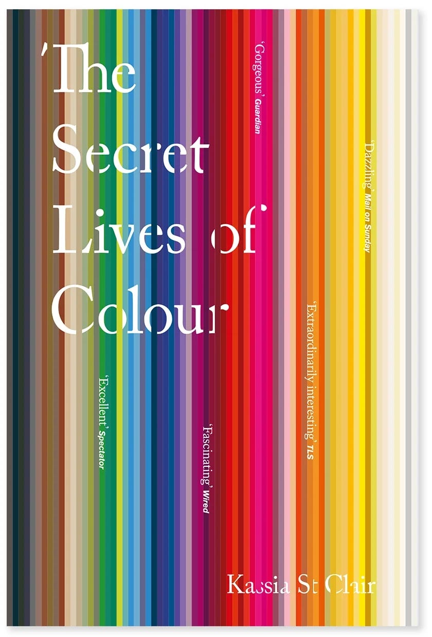
But what in fact do YOU see when I say burnt orange? Or even say just orange, for that matter? Turns out, in the English language, we’ve only been calling a particular colour orange, since the sixteenth century. According to Kassia St Clair, in her exemplary, comprehensive, and quite fabulous book The Secret Lives of Colour (which you need to experience in print – please don’t do it digitally), one of the first recorded uses of orange as an adjective occurred in 1502, when Elizabeth of York bought ‘slevys of orange colour sarsenet’ for Margaret of Tudor. Prior to that, English speakers used the word giolureade. Essentially: yellow-red. Certainly more cumbersome, and vaguer than just: orange. But workable.
And obviously still relevant when, during the twentieth century, Kandinsky described orange as ‘red brought nearer to humanity by yellow’. Rather lovely, non? But these are only baby steps. We’re still some distance from the confusions that can arise when terms like Dutch orange, saffron, amber, citrine, ginger, minimum, and nude, all cozy up together under the larger umbrella that expresses: orange.
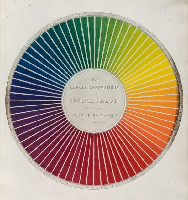
Our knowledge of – and list of names of – colours is constantly expanding, and contracting (some colour names have been known to vanish after pigment supplies dried up), and evolving. International colour company Pantone launched their business in 1963 with a matching system of 500 colours. These days they offer more than 15,000. And when colour computers began in the ‘60s/’70s their screens could distinguish between 256 different hues. Good quality laptop screens these days? That humble 256 has leapt to 16 million. Will we continue to find and name new colours, well into the future? Comparatively speaking, might people from the year 2502 look back on us as ‘those poor, colour-starved peasants of the early new millennium?!’
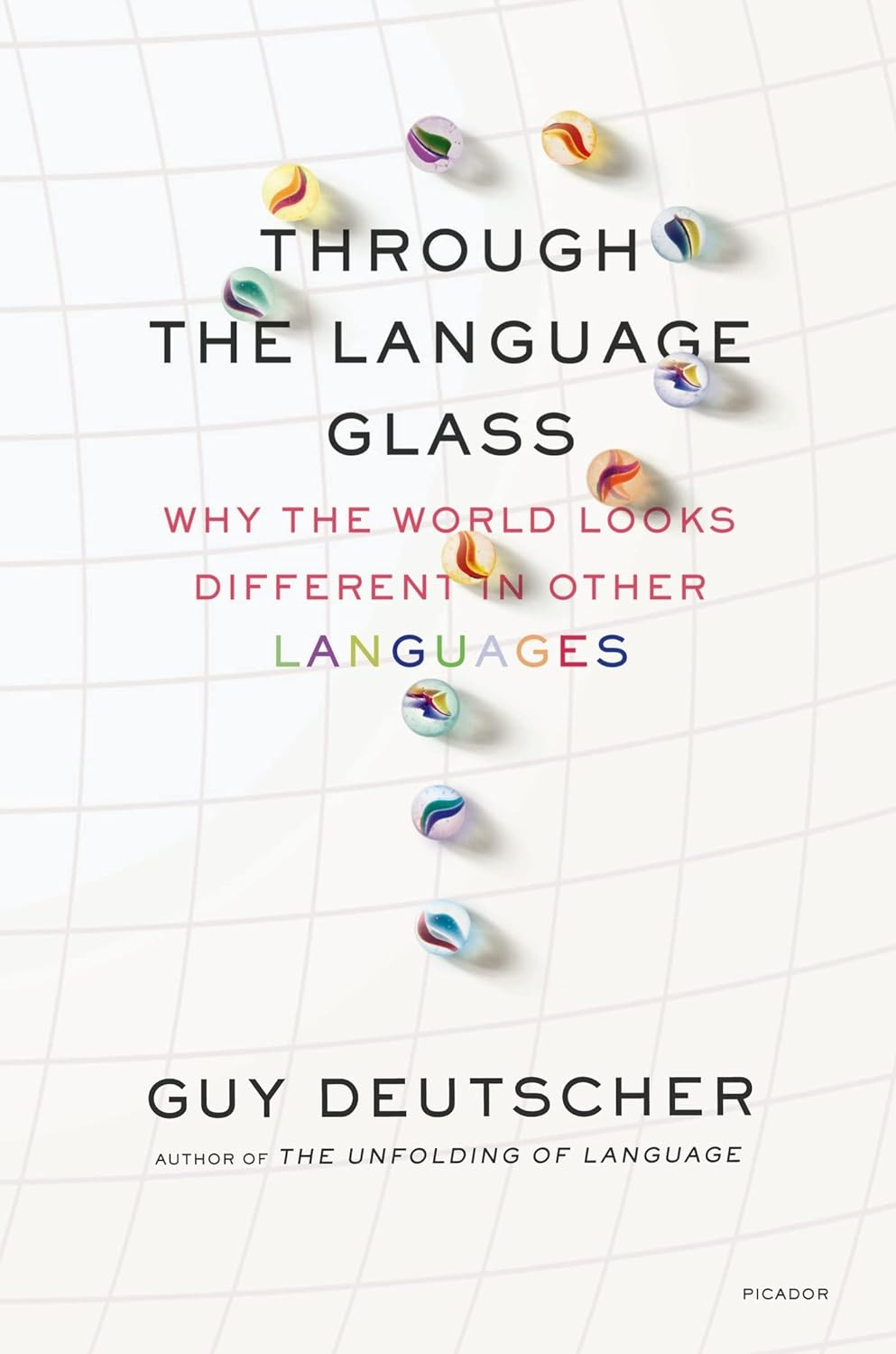
And how about this brain twister. Can we even see a colour if we don’t have a name for it? In 1858, only a few short months before Darwin’s evolutionary ideas expanded (and melted) minds around the world, the Right Honorable William Ewart Gladstone, an eminent British politician and formidable scholar of ancient Greek, made a rather startling claim of his own. After an exhaustively precise dissection of Homer’s epic poem The Iliad, Gladstone came to the conclusion that the denizens of ancient Greece did not have sufficiently well-evolved eyes to be able to see all the colours we can see today. How did Gladstone draw his conclusion? Because, as Ira Deutscher explains so entertainingly in his book Through The Language Glass – Why the world looks different in other languages, Gladstone discovers that there is ‘something seriously amiss with Homer's descriptions of colour.’
For starters, Homer refers to the ‘wine-dark sea.’ Really? Does it taste like red wine, as well? And he uses the flower name ‘violet’ to describe sheep, iron, and again the sea – presumably at a different time of day. (After all the wine’s run out.) Homer also uses no words that equate with things we would associate with green, but he does use chloros – a kind of green, to describe ‘faces pale with fear’, twigs, olive wood and of course, honey. (By the way, you’ll find my jars of green honey on the shelf right next to my bottles of ‘sea-blue wine.’)
Furthermore, Homer’s references to any brighter hues are vague and inconsistent, and his palette entirely lacks equivalents to what we would call orange, or pink. But perhaps most astonishing of all, he never once refers to the sky – not just any ol’, but the GREEK sky for heaven’s sake – as being blue. “His sky is starry, or broad, or great, or iron, or copper; but it is never blue."
Now, Homer was no dufus. And Gladstone, who went on to become prime minister, was none too shabby in the brains department either. So how did they get tangled up together in such colour-bereft, muddy waters? To untangle them, we need to jump into some ‘light science’ for a moment.
As Kassia St Clair states:
“It was only in the seventeenth century that the idea emerged of red, yellow and blue as primary colours, and green, orange and purple as secondary ones. Prior to that, the ancient Greeks saw colours running along a continuum from white to black. Yellow was a little darker than white and blue was a little lighter than black. Red and green were in the middle.”
And apparently this arrangement suited medieval writers just fine as well. Right the way up until Isaac Newton published Opticks in 1704, in which he shared discoveries he had made by passing light through a prism. At which time he also identified the ROYGBIV colours (red, orange, yellow, green, blue, indigo, violet) that make up what we have since come to refer to as ‘the visible spectrum’. Did I mention that Newton’s thoughts were extremely radical for their time? Why? Because the Church’s views (which in many places meant the ONLY views) on colour back then aligned with, you guessed it, the colour theories of the ancient Greeks.
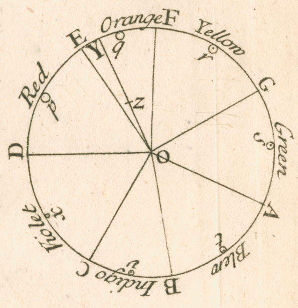
Maybe if Gladstone had done his forensic-level examinations of The Iliad in say, the fifteenth instead of the nineteenth century, he wouldn’t have drawn such evolutionary not-possible conclusions as he did. (Meaning: our eyes could not have ‘evolved’ from being effectively colour blind to being colour proficient in a period as short as 5,000 (or even 10,000) years – a mere nanosecond in evolutionary terms.) Post Newton’s Opticks however, Gladstone became something of a victim of his times in that his understanding of how specific colours make up our ‘visible spectrum’ was now at total odds with the ‘light to dark continuum’ model of how the ancient Greeks understood colours. And even more importantly for his analysis, how they named them.
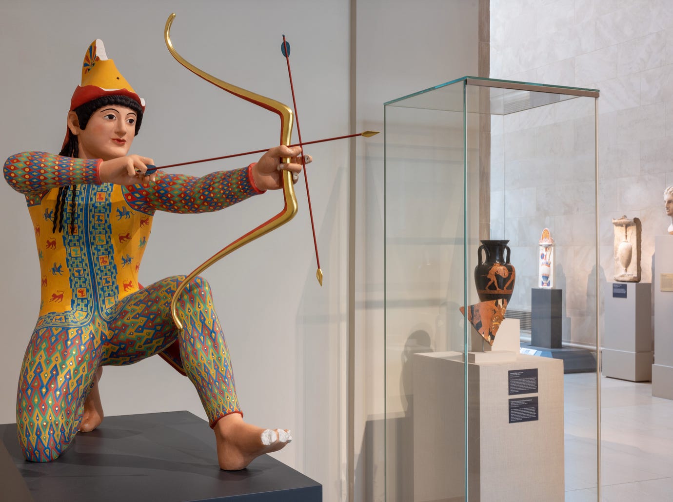
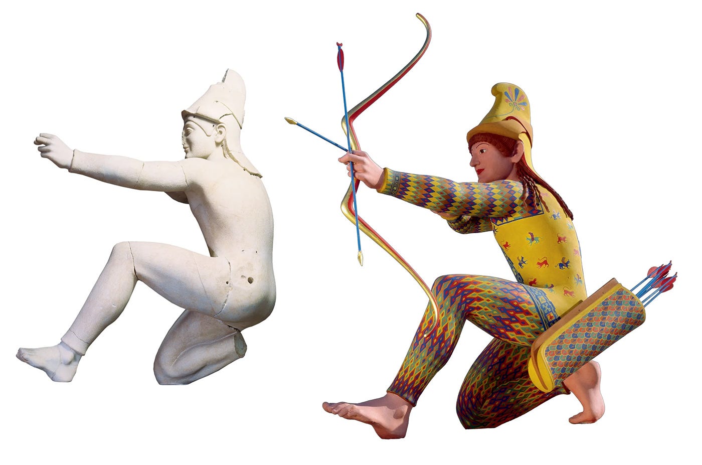
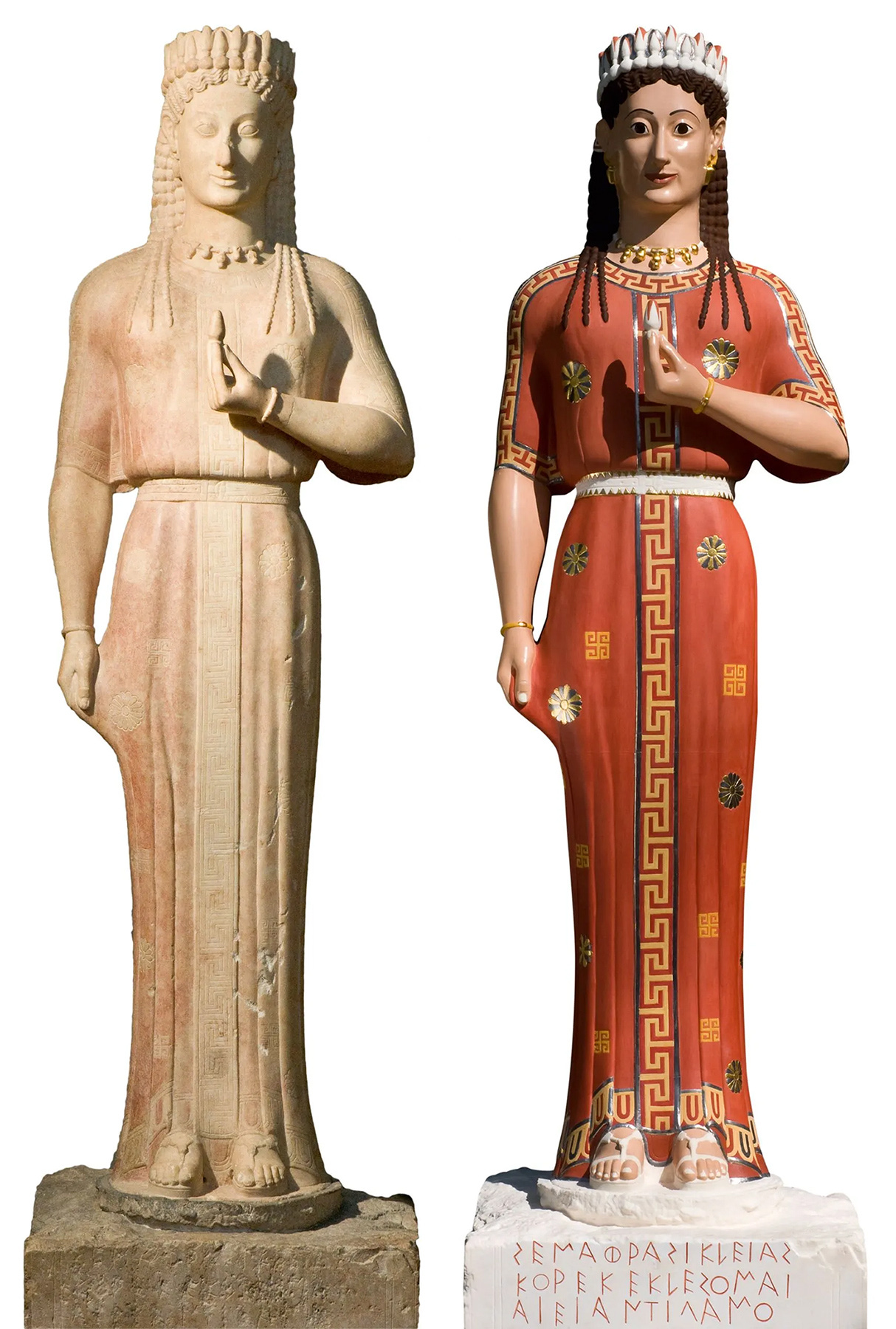
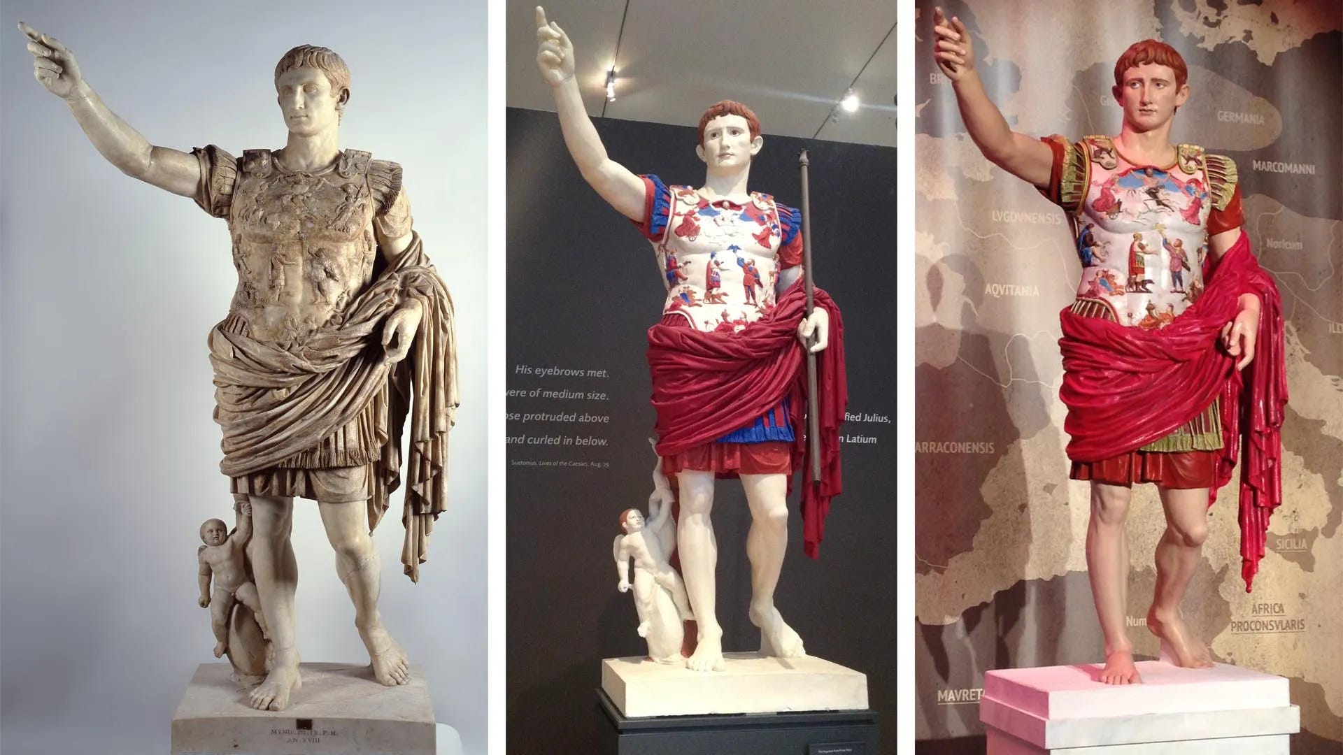
Talking of those Greeks, and by association those Romans, have you caught up with how much our knowledge has been changing in recent years regarding how we ‘picture’ the ancient world? You know, that world inhabited by gigantic, or realistic, muscular, sad, powerful, expressive, emotive figures, all impeccably carved and crafted from the purest white Carrara marble? Well… in short it turns out there was a whole lot more going on than just pure white. Ancient Greek and Roman sculpture was once colourful, vibrantly painted and richly adorned with detailed ornamentation.
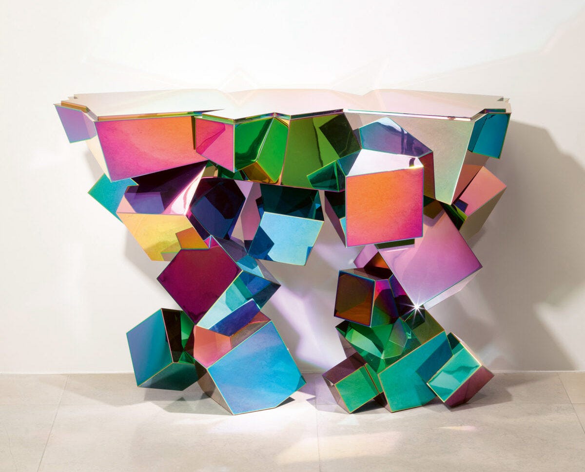
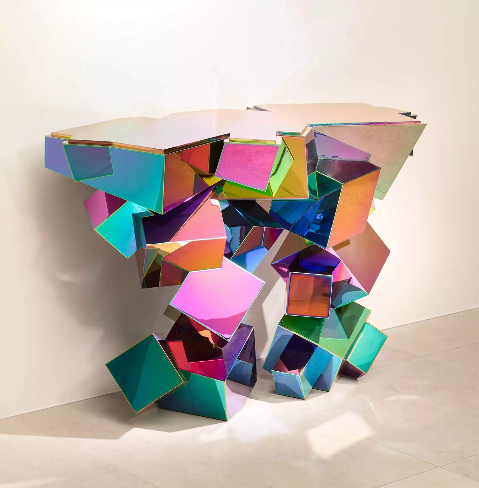
After this many words already, I’m going to make a change of pace by letting some pictures tell you a (few) thousand words instead…
(And if you’re interested to know more, visit The Met’s website for Chroma: Ancient Sculpture in Color, which is also touring internationally.)

Okay, before concluding Part One, I have to share just one more story from Guy Deutscher’s book. Because it’s too good NOT to share! The subject? Traffic light colours in twentieth century Japan. Because this one is so absurdly wonderful in its absurdity, I’m afraid it makes the Homer & Gladstone story sound perfectly sensible.
Firstly – I guess I never had cause to think about this before – did you know there is an international convention that ensures road signs have a measure of uniformity around the globe? Which, necessarily, includes the approved hues of red, yellow and green traffic lights, defined as regions of the standard CIE 1931 chromaticity diagram? It almost gets me teary to learn that we CAN all manage to agree on certain things, on a global scale!

So anyway, when traffic lights – imported from the US – were first installed in Japan in the 1930s, the green of their lights was just the same as the green of lights in other countries. Now. The three primary colours on Japanese artists' palettes are traditionally aka (red), kiiro (yellow), and ao (green). However – as we now know! – colour names and associations can change over time. Traditionally, while ao indeed meant green, it usually described greens over in more of the bluish tint of the spectrum. But as the years rolled by after the traffic light installations, something occurred linguistically. People shifted towards using midori for green, instead of ao. Which started to get tricky when referring to the go colour of traffic lights. Do you go when the light turns ao? Or when it turns midori?
What do you suspect most countries might have done, to solve this linguistic / transportation / public safety dilemma? Change the word for the go light to midori, instead of ao? Right? No way, Cho-Cho-San.
In 1973 the Japanese government decreed that reality should be altered to fit the name. Consequently, the hues of their green-for-go traffic lights, the entire length and breadth of the country, were altered to include more of a bluish tint (still safely within the green levels of the chromaticity accord) to properly adhere to the linguistic colour of their green-for-go lights. Which in Japanese is (still) ao.
So if you ever visit Japan and notice their green lights are tinted sea-blue, now you’ll know why. Which reminds me – time for a glass of wine!
Thanks for reading A Splash Of Colour (In Your Day) - Part One.
If you’d like to continue to Part Two, you can do so at this link!
Love and light,
Matthew.
(Anything about colours you’d perhaps like to share? Or questions you might like answered during Part Two? Please feel free to share, or ask or comment below.)

Thanks Matthew - Ethel T would be proud of you! I love your bright thread - just what is needed to keep us more-or-less on track.
I am lucky enough to be back in Paris and experience going to see the Mark Rothko retrospective exhibition at the Fondation Louis Vuitton. It prompted me to re-read A Splash of Colour. It would seem that I must have colour on my mind and consequently had two great revelations at the exhibition. The first of which, and the most surprising, was that Rothko was formerly a figurative painter with impressionist overtones in his early career. His work, almost defined as eras, had a gradual progression in style. From his early portraiture, to a series of work based on the New York subway and it architectural shapes and how the transiting passengers inhabit them, then progressing through more lyrical abstraction, before settling into the multiform large format "blocks of colour", the bold abstract expressionist paintings that we all recognise as Rothko's signature works. The second was that Rothko loathed the label of "colourist" as if it was an insult to the sensibilities he strived to achieve in his works, despite his works sometimes being described as “colour field” paintings. Let me explain, as this is in no way a detraction away from the subject or contents of the Splash of Colour, quite the contrary. In Rothko's words he was exploring light through the expression of colour, their luminosity and vibrancies. The subtleties of his light or feathering brush work and subsequent layering of pigments creating depth and a myriad of tones and hues rather than straight forward expressions of colour. Colour, he stated, is "merely an instrument" for greater emotional expression.
Matthew, I love your idea that "our knowledge of – and list of names of – colours is constantly expanding " and that we are still discovering colours and ways to describe them. It’s like a quantum departure from the grounding in Newtonian physics or the mathematical measurement used to define the visible spectrum of light, ROYGBIV, the spectral colours. Not unlike what I think Rothko was achieving in his work and his loathing of the label colourist. What’s wonderful about human eyes is their ability to see more than just spectral colours. They are able to discern the mixing of spectral wavelengths in light, giving way to an infinite palette of unsaturated colours. The in between and far beyond colours, a bountiful myriad of subjective responses.
In the subdued light of one the galleries of the retrospective were a series of seemingly black paintings, exquisitely lit around their perimeters. Challenging monochromatic works! Through a longer observation and an adjustment of your eyes layers of faint colour peaked through. Tonal depths, you might say, began to appear and the gallery seemed like it was full of contemplation. A room of people looking for and discovering deeper meaning in the hues and shades of deeper expression. Theoretically black is an anomaly, it’s not a colour. It absorbs all the visible spectrum of light and in essence is the absence of light. In the purest sense of black all light is absorbed and nothing reflects back. But, thanks goodness, in art its considered a colour as it deepens mood and visual impact. These Rothko works, in among his usual bold colour paintings remain revelatory but sober explorations of light.
So in many ways I think of that splash of colour as an exploration in light. I remember one of my early mentors, Terry Bryne (ACS ) a master cinematographer who had a great passion for art, explaining to me that the great cinematographers always paint with light and in the flutter of the shutter, capturing it in the light sensitive layers of a film emulsion passing through the film gate . A magical process of capturing dreams and memories in combination of physics and chemistry.