A Splash Of Colour (In Your Day) - Part Three
Of greens & browns in The Piano, London reds, South Pacific blues & Vantablack
You can also listen along if you like, as I read this article for you, out loud.
Having shared thoughts from eye surgeon Dr James Muecke, and jeweller Ray Griffiths in A Splash Of Colour - Part Two, today I’m continuing with my Five Wise Friends. Historian Carol Boender, jeweller Mart van Drunen, and first-up Andrew McAlpine, who I’ve known since my New York days in the ‘90s.
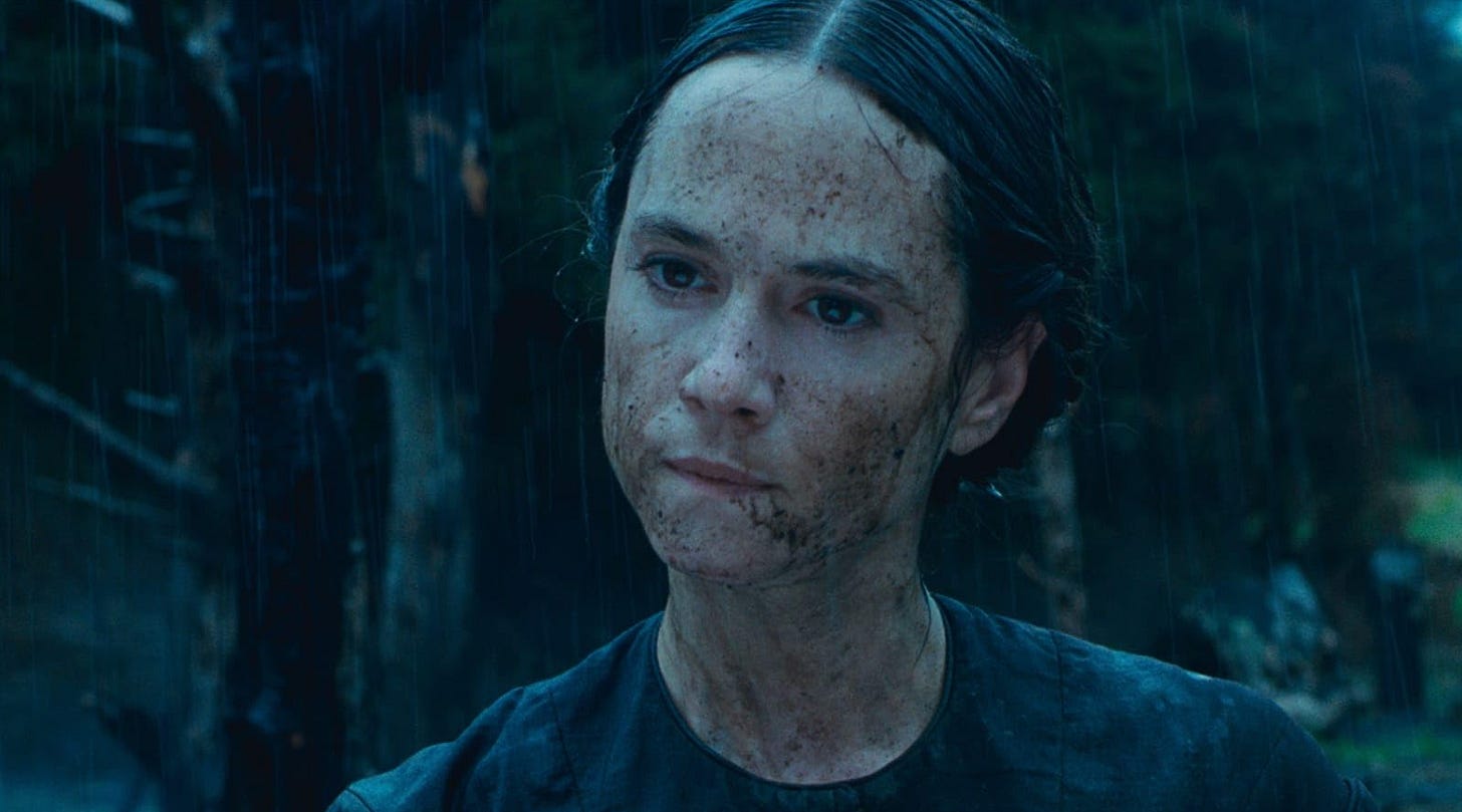
Andrew has been the production designer of over 35 feature films including Spike Lee’s Clockers, Danny Boyle’s The Beach, Lone Sherfig’s An Education, Nigel Cole’s Made in Dagenham, and Jane Campion’s The Piano – which won him both the BAFTA and AFI Awards for Best Production Design.
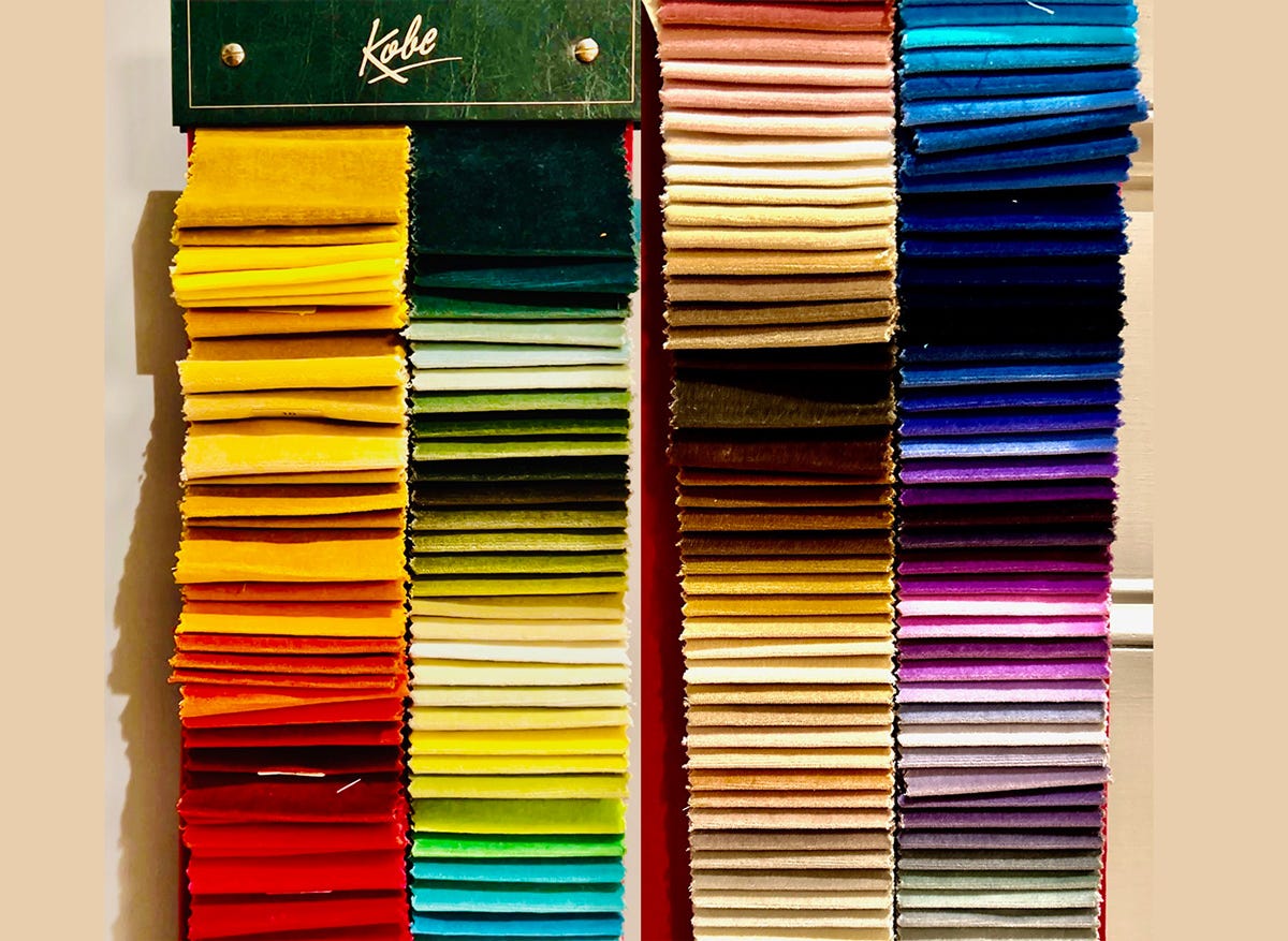
Our conversation takes place over a number of weeks, initially in phone messages - a colour thought here from Andrew, or an inspiration there. And then eventually we speak via video call, me in a hotel in Maastricht, Andrew in the library of his home in London, and our call is animated and totally colour-saturated, from start to finish. From Andrew’s red shirt, to the brightly-coloured spines of the hundreds of books on shelves behind him, to the extraordinary swatch-book of velvets, in every colour imaginable, that he can barely restrain himself from leaping up and grabbing, to illustrate a point.
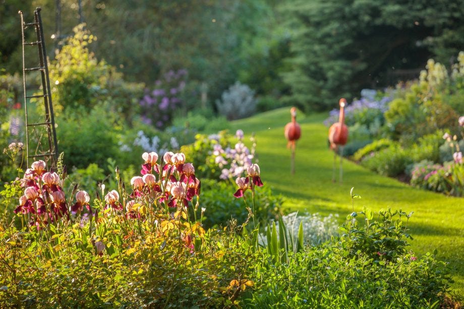
To give you an idea of the colour energy Andrew transmits, here’s just one text fragment that arrived: “Just a warm up so I don’t lose this quote. It relates to a garden at Coton Manor… one of those fabulous gardens here.” And then the actual quote:
“Blue flowers she uses as part of a supporting cast, best against yellow and orange, but not as the main colour in an entire border. She likes to select and limit, not to isolate borders to one colour at a time. She sees a subtlety in shades of apricot pink and she even relates the colours of her troupe of pet flamingos to the summer colours in the border near which they parade.”
Sensing that our colour conversation(s) could expand across universes, I decide to reel us in to the main subject of film.
MC: When you read a film script, are there specific elements you tend to look for, to help you develop a colour palette for the overall production? Or is there no such thing as a ‘colour palette for the whole production’?
AM: Oh, there is definitely a colour palette, and this is something that I really develop in collaboration with both the director and the costume designer. This can also depend a bit on the director. Some are more attuned to colour than others, whereas I am ‘in full colour’ and completely unafraid of colour. I started out painting, and then also worked in theatre and opera for many years, so carry all of that colour appreciation with me, into film.
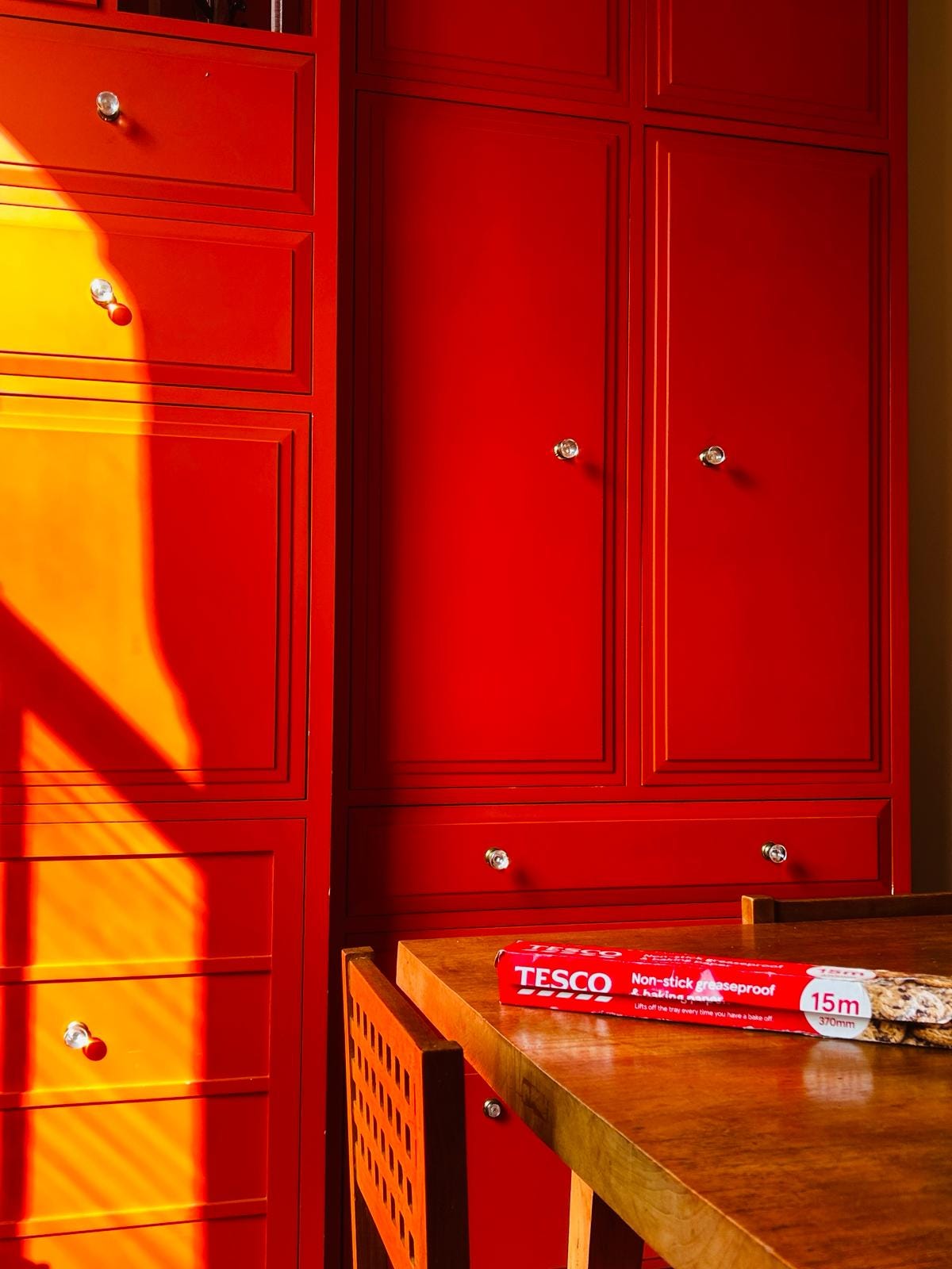
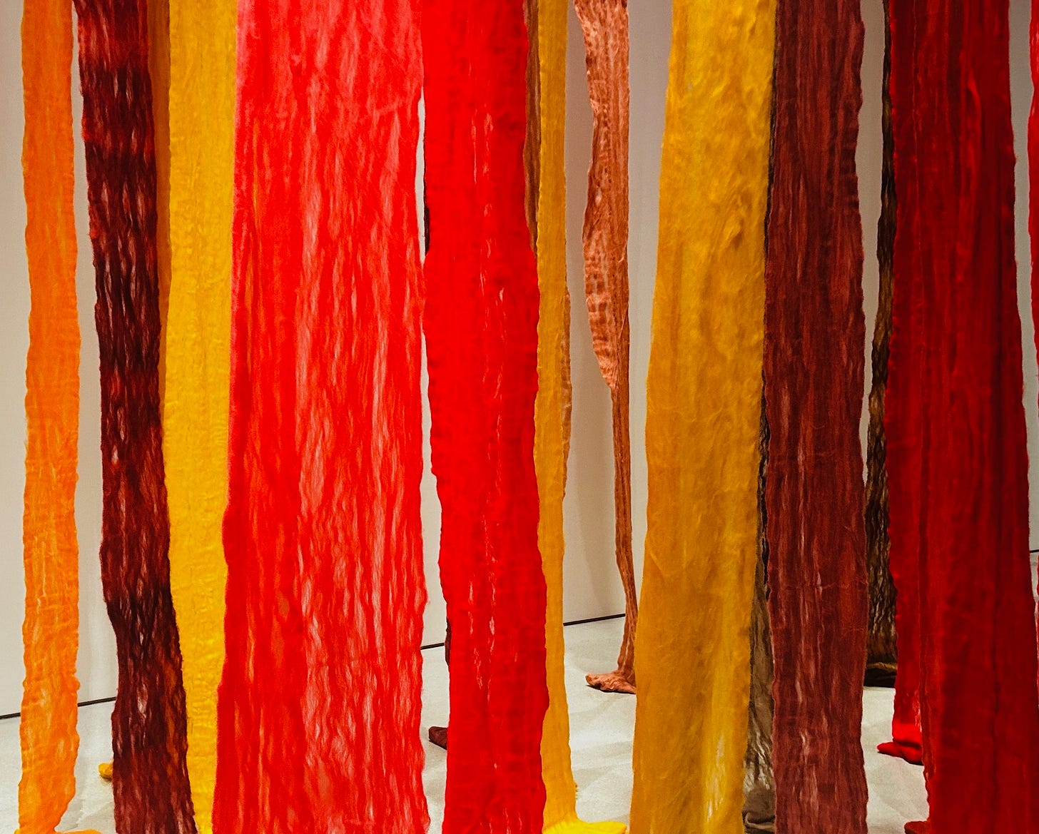
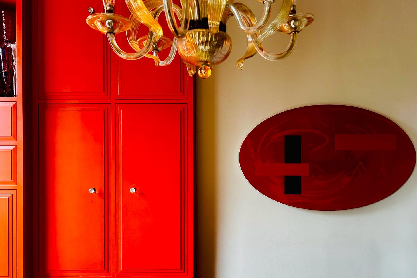
I tend to stay away from red, because it’s such a single colour. Meaning… even when that’s not why you’re using it, people sometimes struggle (mentally) with red – because of red signals / alerts / stop signs etc. It also absorbs a lot of light so is quite hard to light in relation to other colours. Similarly for white – I only use it when I know I can really control the situation. And then I go for it, and do white on white on white. But in a not-easily-controlled situation – because white reflects / absorbs every colour that happens to be nearby – you can find yourself with something totally unlike the white you were aiming for.
(The point above, about red, occurred in two parts - I had to text Andrew back seeking clarification on what he meant by red being a ‘single colour’. His answers came accompanied by photos…)
MC: Was there ever a time when you had to struggle to make the colours on a production ‘come together’? What action(s) did you need to take, to make things work?
AM: Much of the action of Spike Lee’s Clockers takes place in these quite bare, open courtyard spaces in between a group of ‘projects’ – Brooklyn apartment buildings. Grey and more grey in every direction. Plus, it was late in a hot summer, so any green grasses nearby had already withered into brown. So I needed to grab every opportunity I could to feature strong colours in other locations like the police precinct offices and any scenes at Riker’s Island prison – like strong blues and other dark colours.
The challenge, and a lot of the fun for me, is that it’s my job, firstly, to distil the psychology of the film’s story, and the psychology of when and where it’s taking place. And then I need to interpret that for an audience using colour, texture and form – while keeping in mind that a film is an entertainment vehicle. It needs to ‘entertain’ us. So, while I do not consider myself a theatrical designer, I am conscious of this aspect of film storytelling and employ ‘theatrical devices’ when I need to.
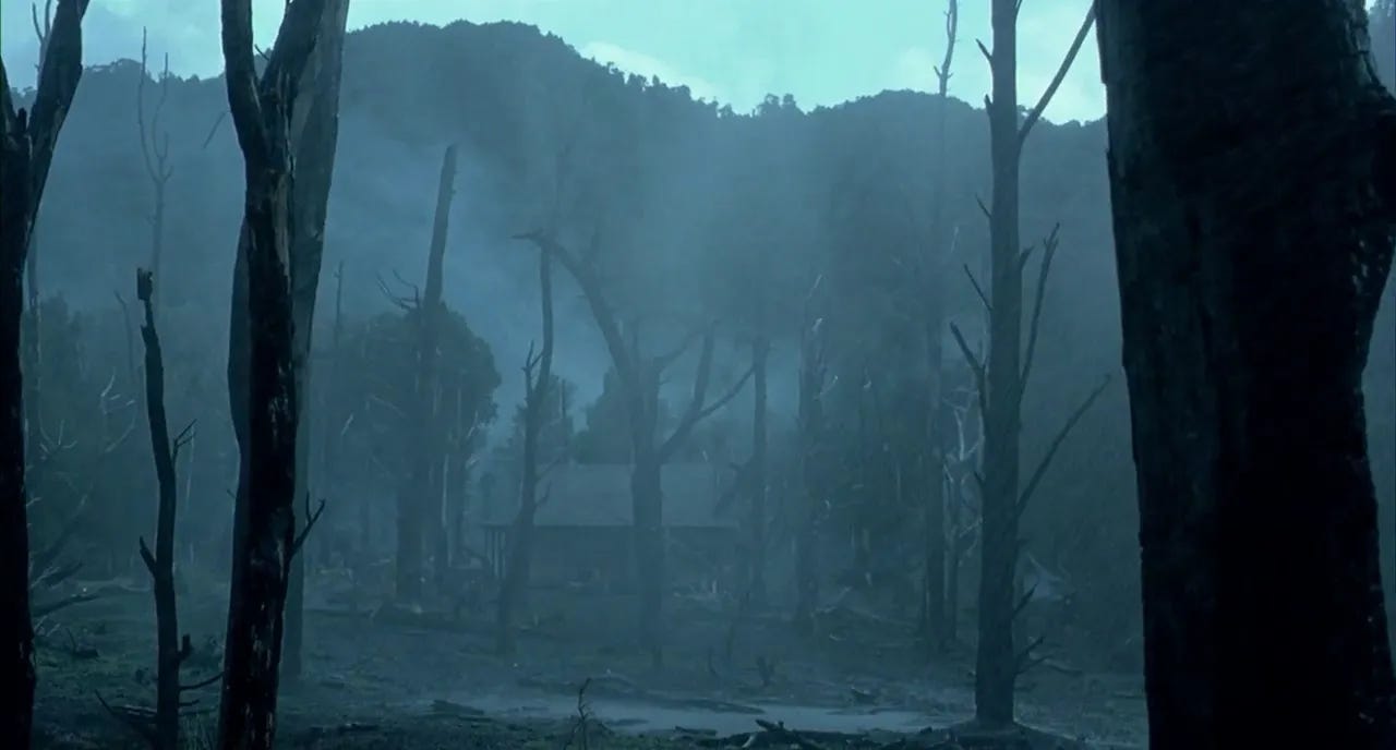
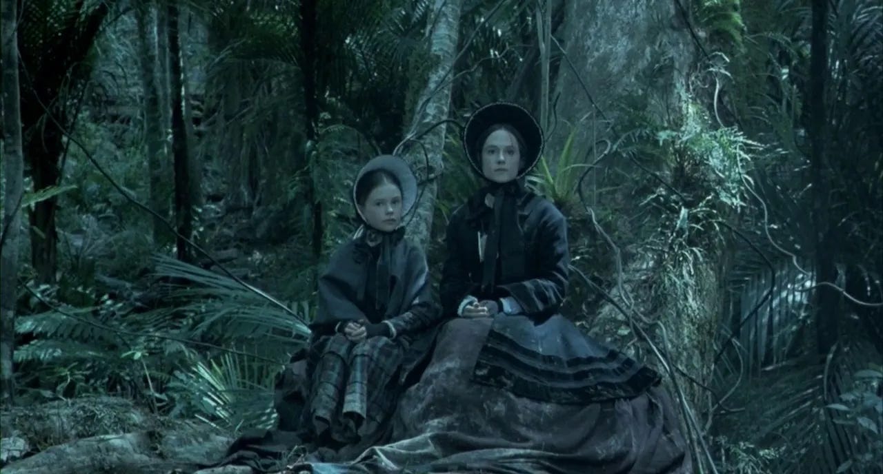
In The Piano, the earth, the soil around the house where the principal action takes place is quite brown. But I felt we needed to depict a greater contrast between the brilliantly lush greens of the natural New Zealand landscape, and the places where the settlers had arrived and decimated the land they encountered. So we stripped the trees right back to make them look bare and denuded, and over a period of a few months before filming, we added 28 tons of coal to the soil. I have a huge love of black as a major colour, and often use it to provide a base note.
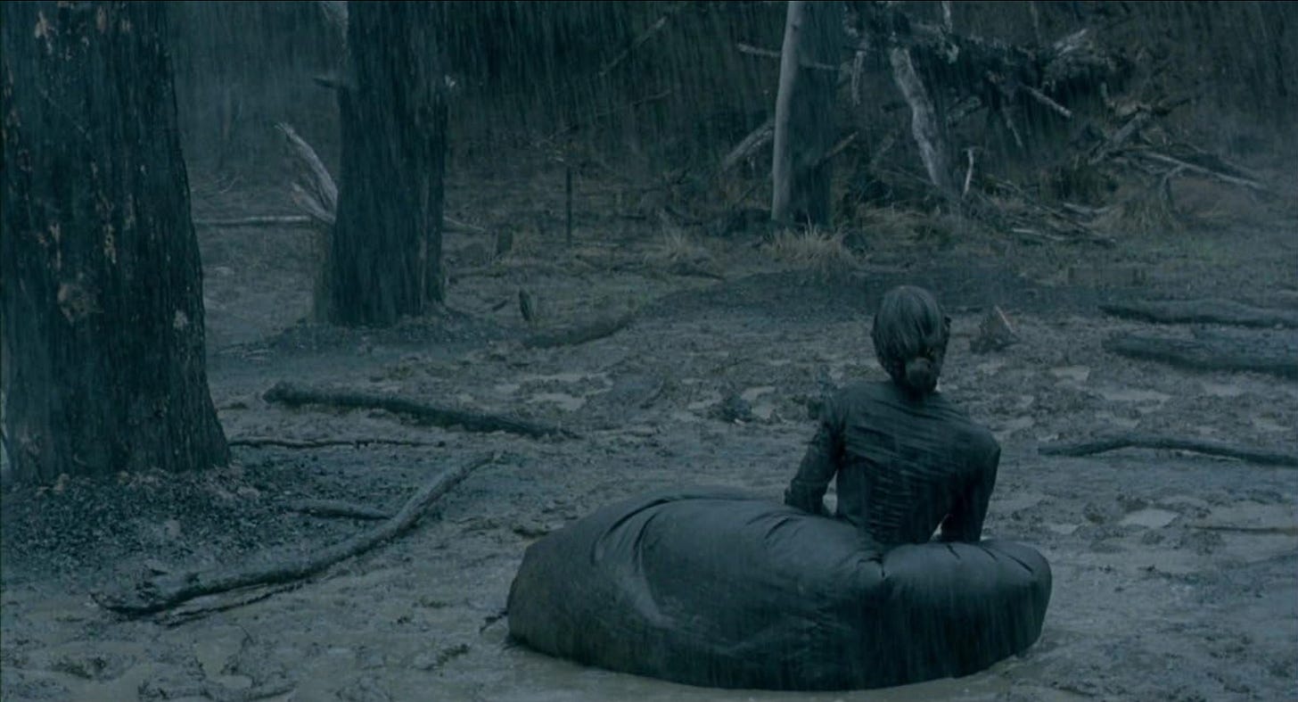
(After our conversation concluded, I became concerned how this last part might sound to readers today, so I texted back with: “Really? Was that okay for the soil that you added 28 tons of coal to it?” Andrew’s cheery reply: “The soil ‘ate’ the coal all too quickly. As there was so much water pumped onto it, to make it into acres of black mud!!!”)
MC: Do you find most of your colour inspiration in the natural world? Or in other films? Museums/galleries? Or simply everywhere?
AM: I love nothing more than going to a fabric shop, you know, of an industrial sort, where interior designers go to source what they need – and sometimes I take my entire team, and we just wade through, almost wallow in all these different colours.
(MC: Because this is so different to a computer screen, yes? Texture adds a whole different perspective?)
Exactly!
(Which is roughly the moment when Andrew MUST grab his velvet colour swatch - photo right at the top of this story.)
I mean look at these colours! Can you see them?! But the world these days has become so desaturated, and drained of colour. Every hotel interior is beige! That’s what comes from 13 years of conservative governments – the idea of risk-taking has gone out the window.
Yet colour is a mainstay of my design processing. So a huge subject. And of course I love that you’re writing about it.
Colour is a huge subject indeed, and we could have talked for many more hours, but thank you Andrew for all this wonderful input!
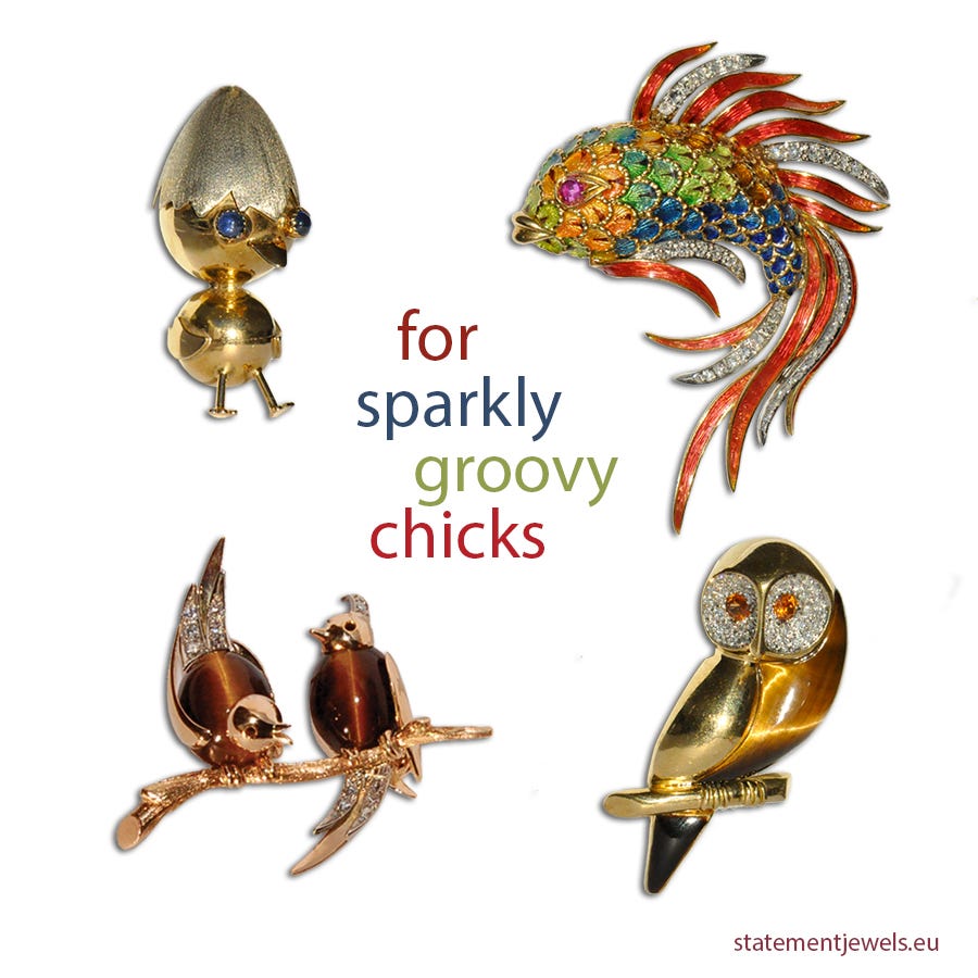
Another Wise Friend I spoke to was European jeweller and appraisal expert Mart van Drunen from Statement Jewels who, full disclosure, also happens to be my husband.
MvD: Hhhmm, difficult to comment upon because my life is all about dealing with colour, which is the case with my clients and all of my friends, who are also colourful and love wearing colours – I guess like attracts like – I’m not good with people who are ‘grey’. They don’t like me, and I don’t like them!
MC: Any times when life was drab? What did you do? How could someone perhaps ‘brighten up their life’ if they needed to?
MvD: Of course there have been dark, and hard times. But I’m very good at forgetting unpleasant things! And I’m also very good at seeking out the bright, or sunny side. For instance, I don’t understand why people dwell on the greyness of winter and let it upset them. You can’t do anything to change it, so don’t look at it! Redirect your focus onto other things that will bring you colour.
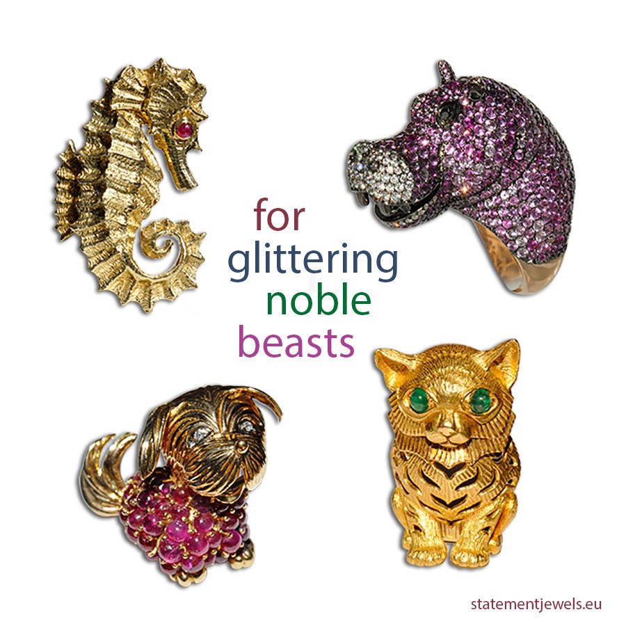
MvD: One of the things I love to do is give compliments, often to strangers. But usually that happens because they’re already colourfully dressed and standing out in some way. That’s why I see them I guess. I’m attracted to bold, strong colours and people who are not afraid to use them so… come to think of it, yeah, I guess colour in many ways dictates my social surroundings. And… it’s always been in my life. I’ve always been attracted to gold and bright, shiny things – a bit of a mocking bird I guess – but I mean my mother was wearing kaftans with gold thread through them, and driving a canary yellow Matra sports car. I guess I don’t think about colour so much because it’s always there. I only notice it when it’s absent, when a space is devoid of colour, but at the same time I don’t really know those spaces because I avoid them at all cost!
MC: As the writer / interviewer I realise I need to interject an extra thought at this point, about a time when we both experienced natural ‘colour saturation’ to the point we thought our heads might almost explode.
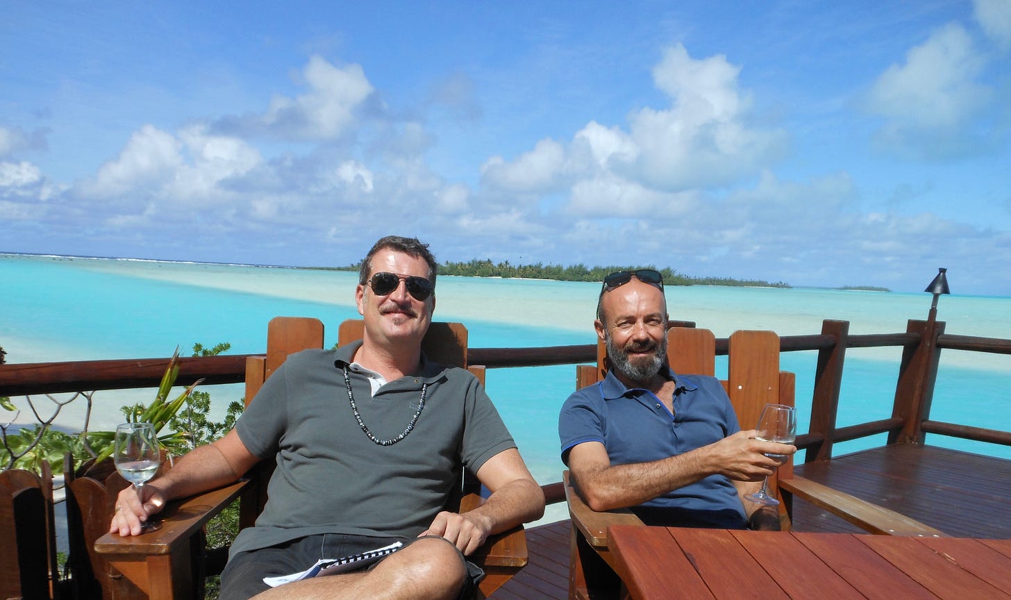
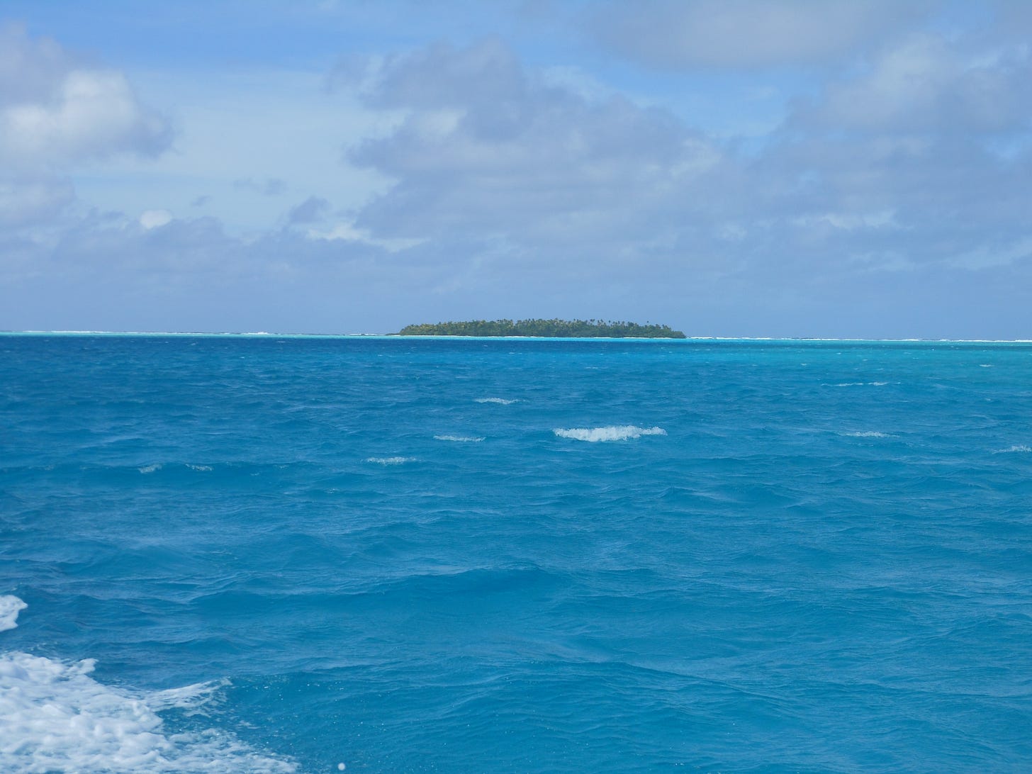
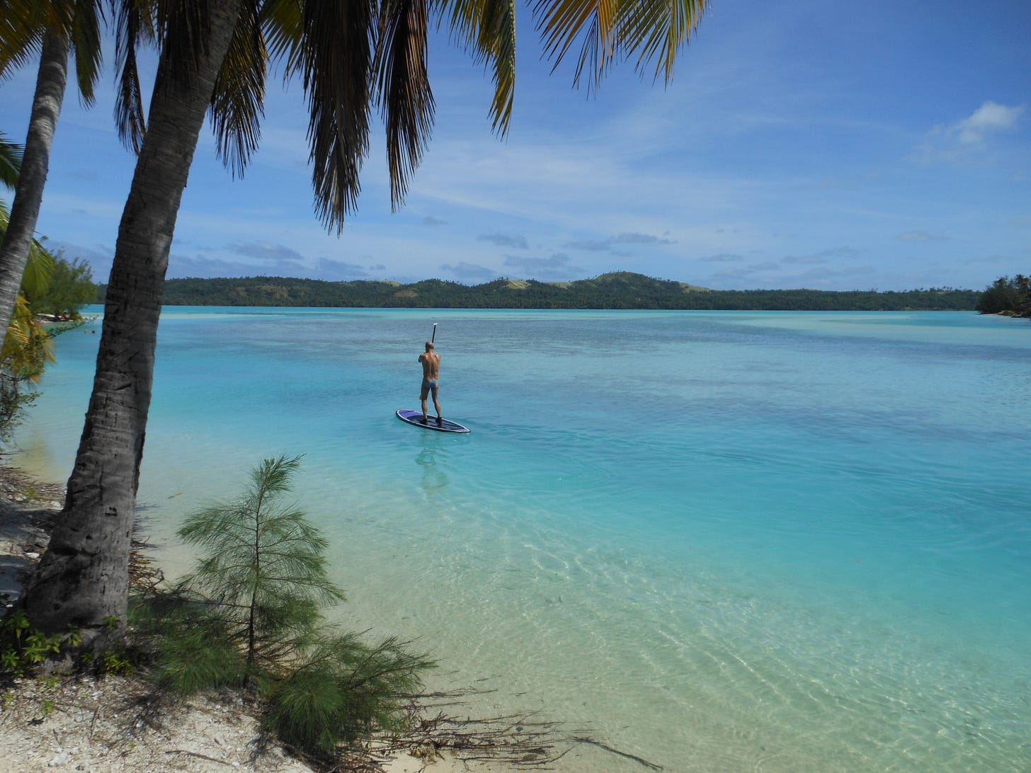
Back in 2016, while staying on the island/lagoon of Aitutaki, within the Cook Islands in the South Pacific, our friends Nick and Marina invited us to join them on a speed boat trip across the main lagoon. Just the four of us plus a local Aitutakian driver in a small boat. Brilliant. Off we went.
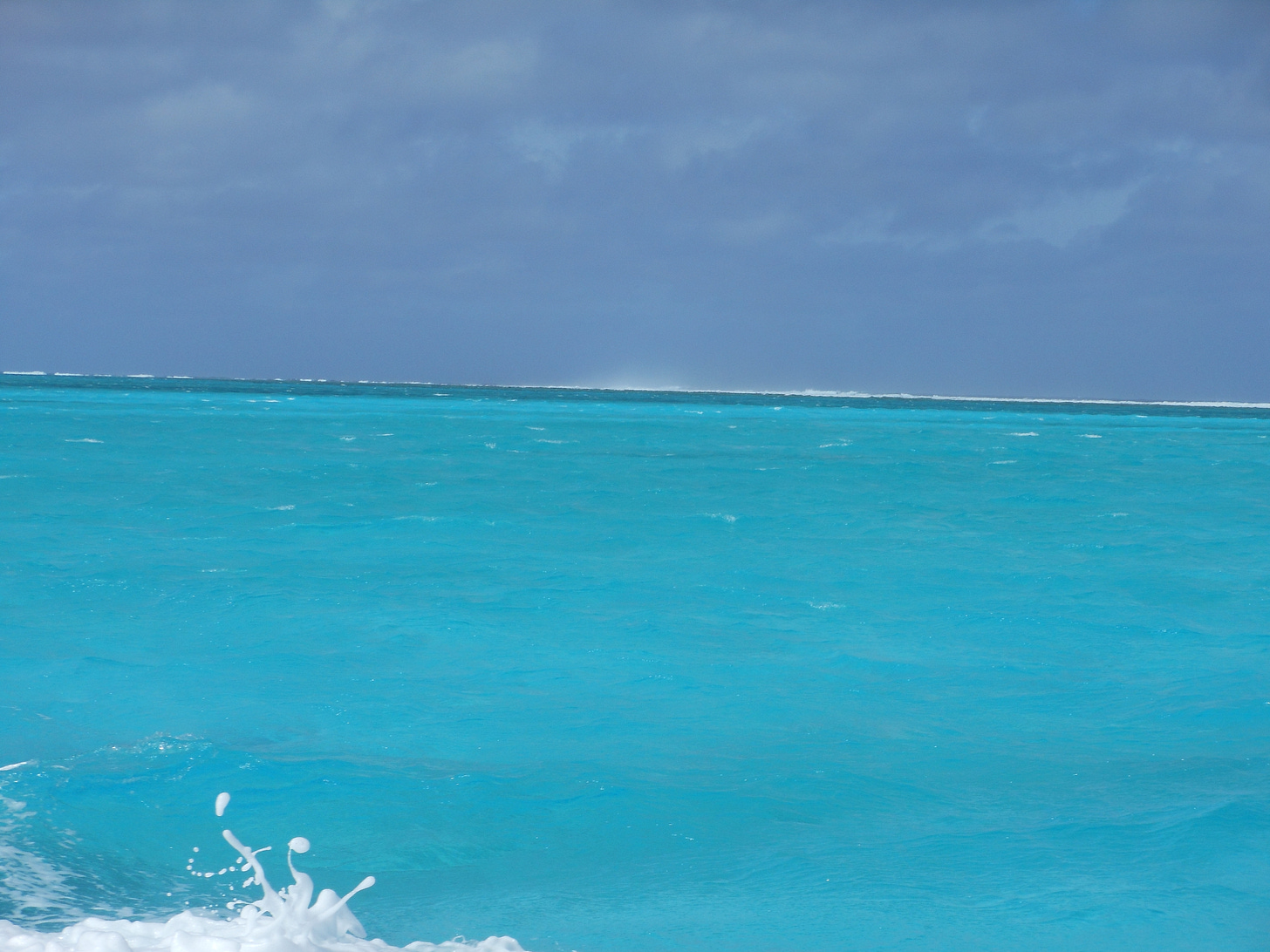
We anticipated blue, but what we did not expect was the intensity of the million shades of blue we encountered, which we learned arise from two main reasons. 1: The lagoon is relatively shallow, and 2: its sands are incredibly white. So… as we sped across its surface on a bright, blue-sky day, the slightest depth variation meant the sunlight would refract differently, changing the colours we would see - from turquoise to sapphire, cerulean, aquamarine, azure, topaz, ultramarine, cyan, cornflower, peacock, teal… all in the space of seconds and minutes, causing our eyes / brains to go into a sortof giddy, colour-overwhelm.
My Fifth Wise Friend is Carol Boender: an ebullient, highly articulate combination of historian, beekeeper, gardener, truck driver, book binder, lecturer on colour, and mother and grandmother - who I’ve come to know over many years of visiting The European Fine Art Fair (TEFAF) where she continues to work supporting Bob Albricht at Albricht 19th and 20th Century Master Paintings.
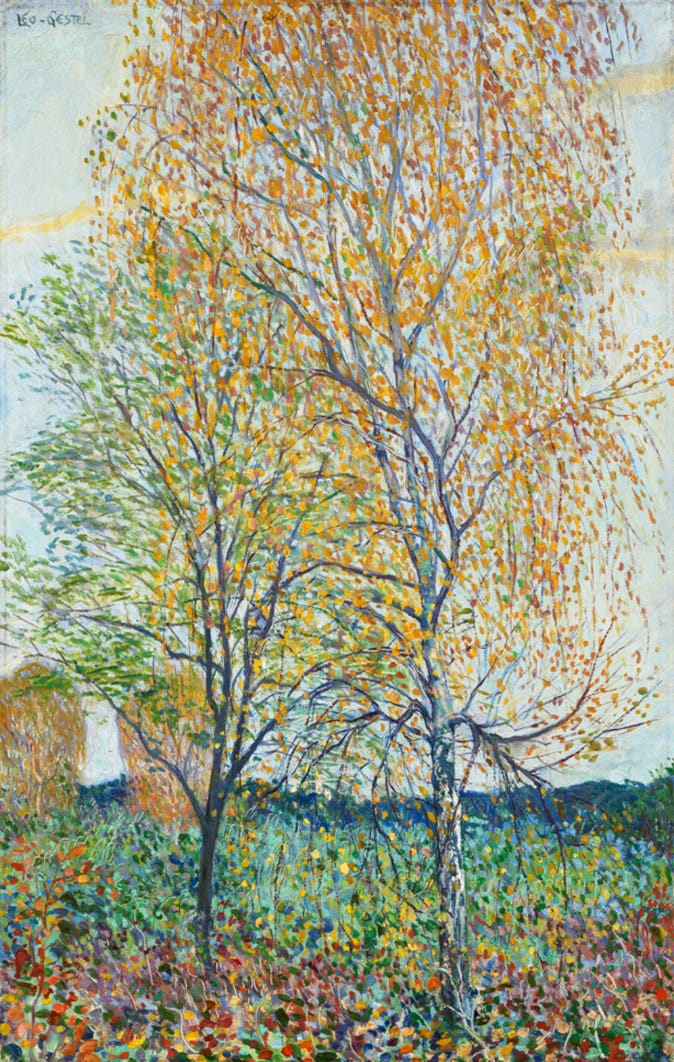
Carol wrote to me with the following:
What are you wearing?
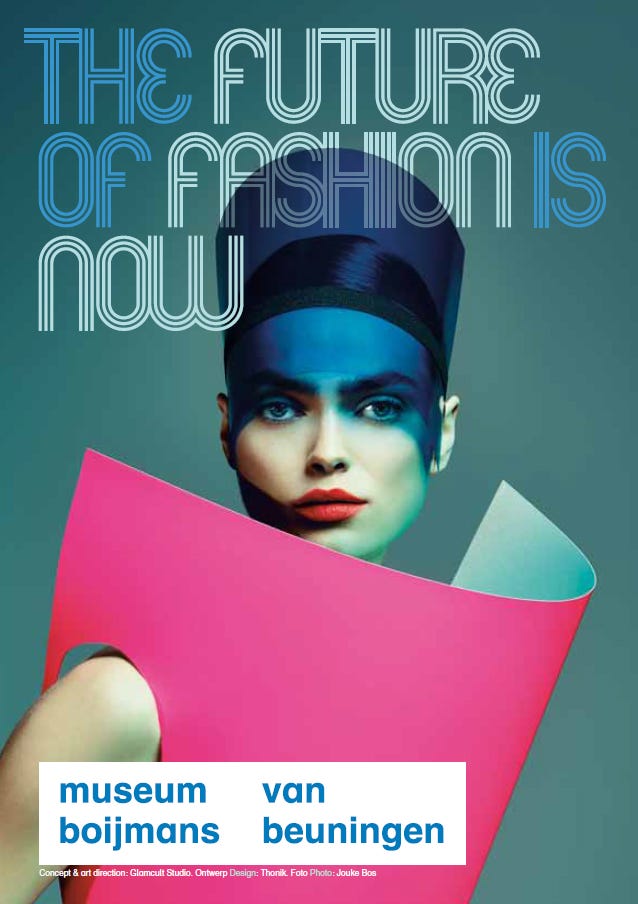
I see a huge increase in museum exhibitions, worldwide, that tackle the subject of what colour and fashion mean to us. In the Netherlands: Museum Boijmans van Beuningen, Kunstmuseum Den Haag, Kröller-Müller Museum, Museum Arnhem etc. Also Palais Galliera in Paris, Ashmolean Museum in Oxford, the V&A in London, and many more.
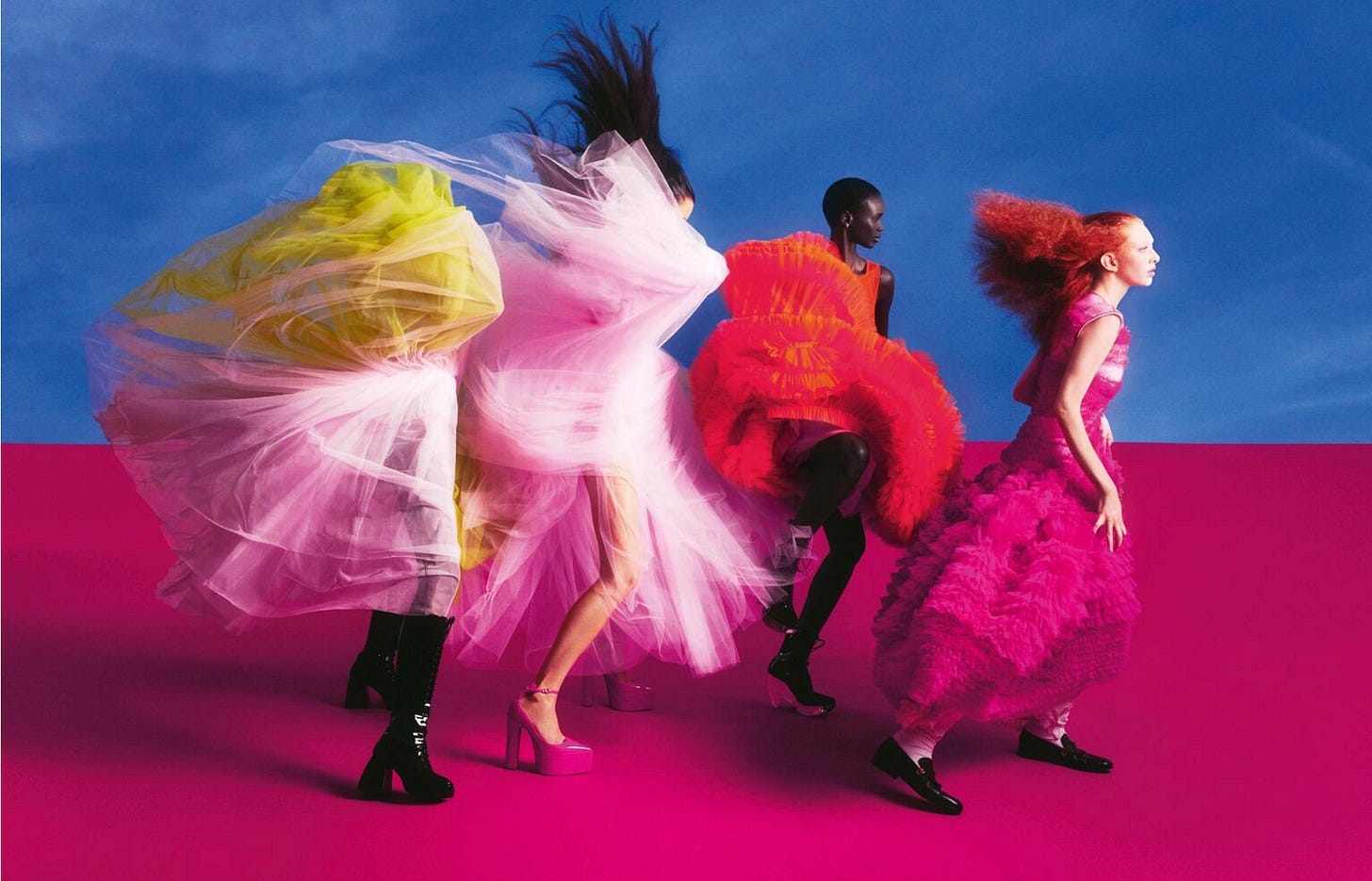
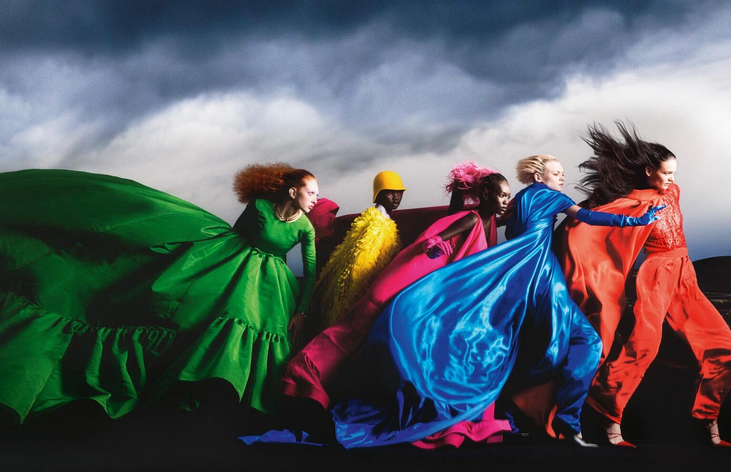
CB: If I were to give a friend help in difficult times I would give she or he a colourful accessory to brighten their lives.
What we wear is our most daily and most frequent thought we give to colour. Even if we only wear black, then sticking to black is a daily (can be small) effort, and an affirmative action. The colours we choose in our daily wardrobe are the ones that reflect the part of the world (north, south, hot, cold) one lives in. Scandinavians prefer soft colour, people in the Caribbean strong colours.
Personal anecdote as an illustration: after having lived in the Bahamas for two years I came back to Holland with a wardrobe full of, in my view, beautiful dresses with prints of birds, leaves, lots of shades of blue like the sea there etc. Unpacking them here I never wore them again (except once for a theme party!) The northern European light was completely wrong for these clothes.
Colours give you ways to belong to a group (teenagers!), and to express yourself to the world. For me, colour in what we wear is perhaps one of the most important aspects of social interaction. We judge and are judged by it. It can make us feel better or worse, confident or invisible, elegant, artsy, homely, sporty etc. Although the science and psychology of colour is endless, I believe that we choose it instinctively.
Tipped off by Carol to this next short subject, I’ll close by bringing us full circle through colour all the way to Vantablack, which is described as ‘the blackest black,’ and ‘blacker than a black hole.’ Vantablack is a class of super-black coatings made from Vertically Aligned NanoTube Arrays (hence: Vanta), that can absorb up to 99.8% of all visible light. Each nanotube is only a few nanometers wide. How big are nanometers? One billionth of a meter. But before I make you glaze over completely, you might want to try watching this short video. Vantablack makes a whole lot more sense once you can see it in action.
Controversially however, outside of when it’s being used for engineering or defense purposes, there is only one person who can use Vantablack for artistic purposes. And that is Anish Kapoor, who was granted exclusive rights by the inventor/developers, Surrey Nanosystems, which of course can lead to all kinds of fascinating questions about the ‘ownership’ of colours. Tiffany blue / John Deere green / Caterpillar yellow / Hérmes orange / Barbie pink - do all these entities really ‘own’ those colours? Some yes, some no. It’s a fiercely contested (and often hugely expensive) topic.
Which brings me to an important question. Should I develop a Bright Side Writings signature colour? And if so, what should that be??!!
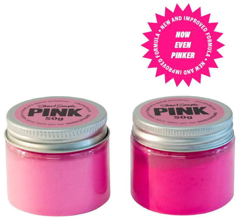
Not so surprisingly, Kapoor’s ‘exclusive rights’ clause set off a furore in the art world. Artist Stuart Semple has since dedicated himself to creating the blackest paints he can, as well as “the pinkest pink” and “the glitteriest glitter”, all available for anyone except Kapoor to use!
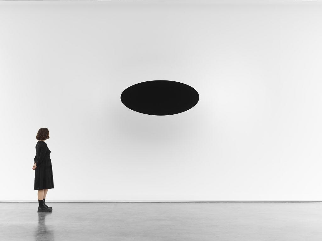
Speaking in a November 2023 edition of Artnet, Kapoor says that what attracted him to Vantablack was his fascination with the void, and his efforts to create the illusion of bottomless depth. “In the Renaissance, there were two great discoveries: perspective and the fold. The fold is a representation of being as we know. If I put this material [Vantablack] on a fold, it would not be seen. The fold becomes invisible—like Malevich, I claim that this takes the object into a four-dimensional space and time, and beyond being.”
And with such a statement I must now conclude A Splash Of Colour (In Your Day) Parts 1-3 - largely for fear that otherwise I will simply never finish! I sincerely hope you’ve enjoyed this foray / journey / expedition into hue, vibrance and lightness, and that it’s encouraged you to think about, or look at, or contemplate ‘colour’ from a few different angles. Or failing that, perhaps it has brought you to a higher appreciation level of ‘four-dimensional space and time, beyond being!’
I’d love to hear any responses, questions or insights in the Comments section!
Love and light,
Matthew.



Loved this episode Matthew. Andrew, Mart and Carol all have fascinating perspectives on colour. Thank you for expertly corralling their voices to the page. Look forward to more!
🩷❤️🧡💛🖤