
Of Word Blunders - And Wonders
The rarefied joys of typographic trip-ups & grammatical mishaps

In my last post I waxed lyrical about the joys of various kinds of travel. In this one, my view is from a different angle: the thoughts that can surface when the possibility of travel is taken away. Notes I jotted down when, you guessed it, we were being subjected to various periods of lockdowns.
While perusing lists of Things We Miss About Travel, I realise I have a sub-topic all my own. While Other People’s Lists describe yearnings for views, restaurants, adventures, sex, museums, nature, and the kindness of strangers, what do I miss? Typographic trip-ups and vocabularic violations. I miss things like… delightfully bad spelling mistakes, clearly-unintended double entendres, and noticed-too-late-before-the-presses-were-rolling grammatical blunders – all of which could add up to those rare and precious treasures I’ve taken to calling ‘word wonders’.
Not things you’d ever thought you could miss? Allow me to elaborate.
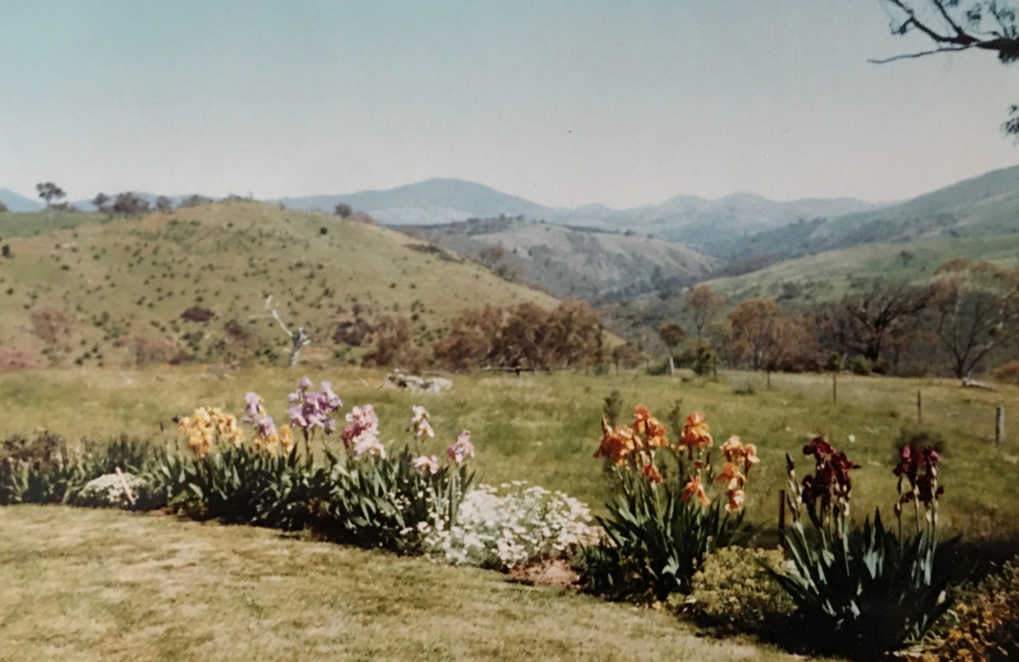
I grew up in Australia, on a farm outside Canberra. As you can see from the photo, topographically speaking there was plenty going on. But typographically? Niks. Nada. The only thing that ever really caught my eye was a lopsided sign, hanging from a gate on a neighbour’s farm, hand-painted in a ferocious red:
SHUT THE FUCKING GATE
with much smaller letters cramped into the lower right corner: PLEASE. Even as a young teenager, the humour embedded in this visual word-composition struck a chord.
Then I moved to Sydney. More people, more word-possibilities. I grew fond of a particular piece of graffiti. Black letters sprayed on a white wall:
REAL PUNKS CAN’T SPELL CAPPOCHINO
– the last word crossed out all the way with one deft-handed spray-stripe, followed by: COFFEE.
Around this time, a friend turned me on to the extra delights of terrible/terrific printed, as opposed to hand-painted signs, via the window-glass of his local laundromat. Exquisitely gold-outlined, classical black letters, applied with painstaking diligence by a – judging by the quality of the work – professional signwriter.
LEAVE YOUR WASHING HERE. WE DO IT AND FOLDING THEM.
Really? No passer-by had thought to stop and tap the poor signwriter – all caught up in adhesives and concentration – on the shoulder to check, “Mate? Are you totally sure about that?!”
Turns out this laundromat was a mere prelude for two other Sydney businesses that would soon attract my attention, via their shared architectural quirk. In many parts of Australia, shopping streets offer broad eaves that extend from the shop exteriors out over the pavements, offering both protection from weather, and hanging points for signage. In Sydney’s Surry Hills neighbourhood there are – as the name would suggest – various hills. So imagine my surprise one day, while striding uphill on Crown Street, to read in sober, silver letters on a black background:
VALUE FUNERALS
followed straight underneath by:
KILLED ON PREMISES
This took the wind out of me to such a degree that I literally stopped in my tracks. Then after a tentative step or two onwards, the truth became apparent. There was a second sign, slightly uphill of, but hidden by Value Funerals, that read in full:
PASCH’S CHICKENS – KILLED ON PREMISES
For years I made a habit of dragging bewildered visitors to this patch of Crown Street, solely to share with them the uphill joys of this particular word wonder.
Gradually what these signs taught me was a simple truth. Keep your eyes peeled. Fun and amusement can be found in unlikely places, so long as you’re paying attention.
During subsequent travels, various highlights I’ve stumbled across include an invitation printed in huge letters on a shop window in Norway: EAT MY MUFFIN! The – to my mind – bravely-named Amsterdam restaurant: MEMORIES OF INDIA. A hair salon in the south of the Netherlands called: COURAGE – which every time I pass it begs a double question. Is this the particular kind of feeling one should muster to walk in to the premises? Or to exit?! Not to forget the humourously rearranged sign on a freshly painted New York subway platform bench, that instead of: WET PAINT, now displayed: AINT WET. Which reminds me of the invitation, in China, to cool off by taking a dip in a SWINING POOL. Or in a tiny roadside shack restaurant in Ubud, Bali, a mere stone’s throw from where Julia Roberts filmed scenes from her famous movie ‘Eat Pray Love’, a creatively re-styled movie poster exhorting: EAT PAY LEAVE!
And for honourable mention: my first-ever arrival into Havana, on a work trip for Cuba Travel Network – for whom I’d recently created the tagline: ‘Welcome to rhythm’. Sure I was a little tipsy from the fun flight from Amsterdam, but the following was beyond my expectations. The arrival card that was handed out on the ‘plane didn’t want me to merely sign my card – that would only be requested by far less musically-inclined nations. It insisted instead, on both the front and back of the card, that before proceeding through customs I should SING my declaration – which I fully intended to do!
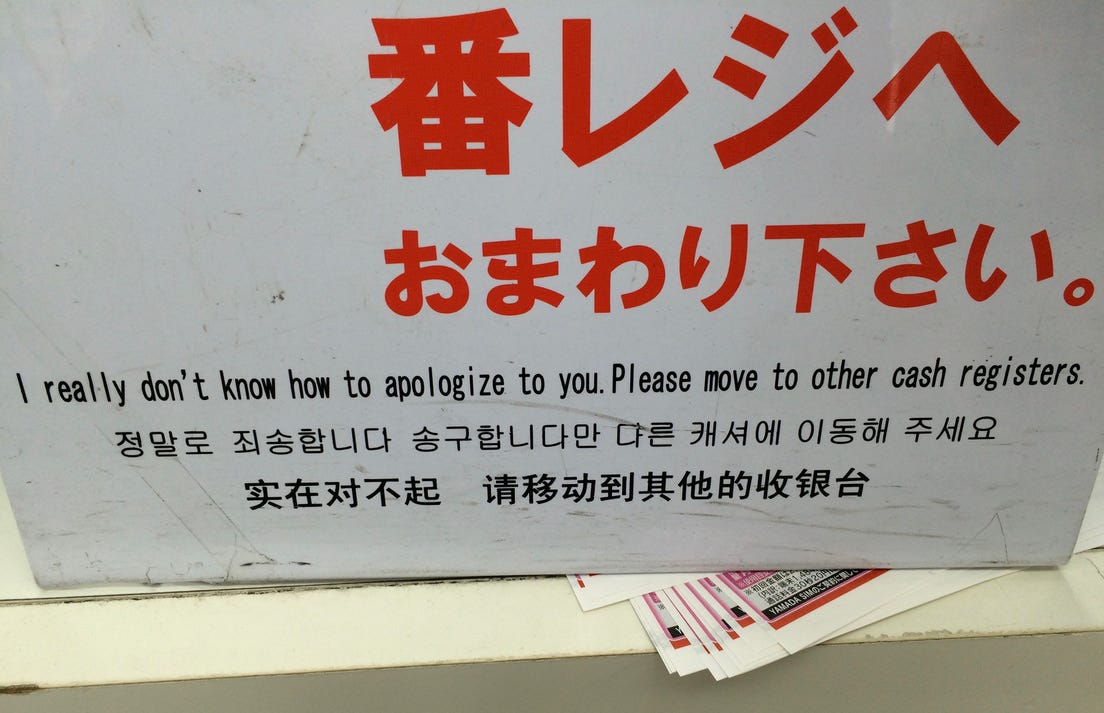
Now, as one might say: there are high school sporting competitions – and then there are the Olympics, so one might also say: there are random word blunders – and then there is Japan. You think you are ready and have prepared for this place, but still it blows your mind once you’re actually on the ground. Let me just say that while living and working in Tokyo some years ago, during my spare time I would go out on excursions devoted exclusively to hunting down the best/worst cases of Japanese-enhanced English I could possibly find.
I will add a culturally-sensitive caveat here though: this article has nothing against Japan - the place, or its people. It is simply a place where I discovered many word blunders because (at that time) many Japanese people did not speak or read English. Which meant that English words and phrases could get used as ‘decorative elements’ entirely separated from their actual meaning(s). Think about it for a moment. Have you ever perhaps fancied a beautiful stream of Japanese (or Chinese) calligraphy on a tea towel or a t-shirt or a carry bag? While being totally clueless as to the meaning of whatever was written there? I rest my case!
Beautifully designed and printed shopping bags were the easiest targets, bearing perfectly proportioned slogans like:
CONCISE. FOR THE SIMPLE MIND.
To the strangely confessional:
MY PUBERTY JUST PLOPPED.
Or the warning / motivational quote / apology – depending on your viewpoint:
FLATULENCE. NOTHING HAPPENS UNLESS FIRST A DREAM.
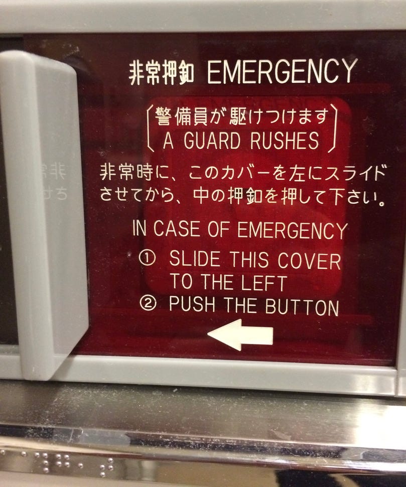
Even the famous Shinkansen (bullet train), carried word treasures – some of the permanent variety like their lavatory sign:
EMERGENCY [A GUARD RUSHES]
– as well as some temporary ones, simply worn by passengers. During one journey I had to stop myself from gawking at an eye-avertingly-shy teenage girl with:
NICE ACCIDENT
writ large across her breasts. A few stops later, a family of Mum, Dad and very young son and daughter entered my carriage, clearly en route to a skiing holiday. The children were both dressed in matching pink and blue puffer jackets, that each bore a Hello Kitty-esque, cute-face logo, upper-left on their jackets, above the super-clearly-embroidered words:
FUCK ME.
While struggling to choke back the hilarity-horror-combo guffaw I was about to emit, I was reminded of the pitiful: WE DO IT AND FOLDING THEM signwriter. Here was my chance to do the right thing! To inform these poor parents! But in a flash I realised my lack of Japanese language skills was not going to help me in this moment. So instead I clapped my hand over my mouth, and then turned this into an awkward sortof wave slash smile. Delighted, the children giggled and waved back at me, in their ever-so-cheerful FUCK ME outfits, while their parents drew backwards a barely-perceptible fraction, from the schizophrenically-smiling foreigner leering at them from only a few seats away.
Naturally I thought this was it; I had attained the Olympic Gold of Japanese-mangled-English spotting. But no. A few weeks later, while trying on an item in a Harajuku clothing store, I realised my Shinkansen experience had only warranted a Silver. Now I really had Olympic Gold in my hands. Or hanging around my neck and shoulders as it were – in the form of a long-sleeved T-shirt (which I purchased in a nanosecond) bearing this poetic? celebratory? confrontational? construction of gigantic bold-faced words:
HAPPIES
MADE TO KEEP
ASSHOLES
OFF OF CARAMEL
CLUB BOYS
What do I miss about travel? All of the above. When I can’t travel, I miss the chances, the opportunities, the possibilities that I might be able to find new, international word wonders to add to my collection. Especially ones of the Olympic word-medal calibre that can make me as happies as the above words, writ large across my chest.
Love and light,
Matthew.

I have a word blunder that I must recant. It happened quite recently and I was discussing something, I am not sure what exactly, but in amongst the conversation there was about the placement of something. Mid word I literally muddled somewhat and out came the new word "inbetwiddle” . Somewhere in between but approximately in the middle. The person I was with and I started laughing , it seemed like the perfect word and it’s meaning quite clear. I love wordsmithing but this little gem seems to hang around now as part of my personal lexicon. Also thanks for the memories, both the corner of Crown and Oxford St and just thinking of that Pasch’s sign and I am sure I must have seen that gate’s sign, cycling between The Cotter and Uriara Crossing.
I love words, and I particularly loved this one. Thank you.